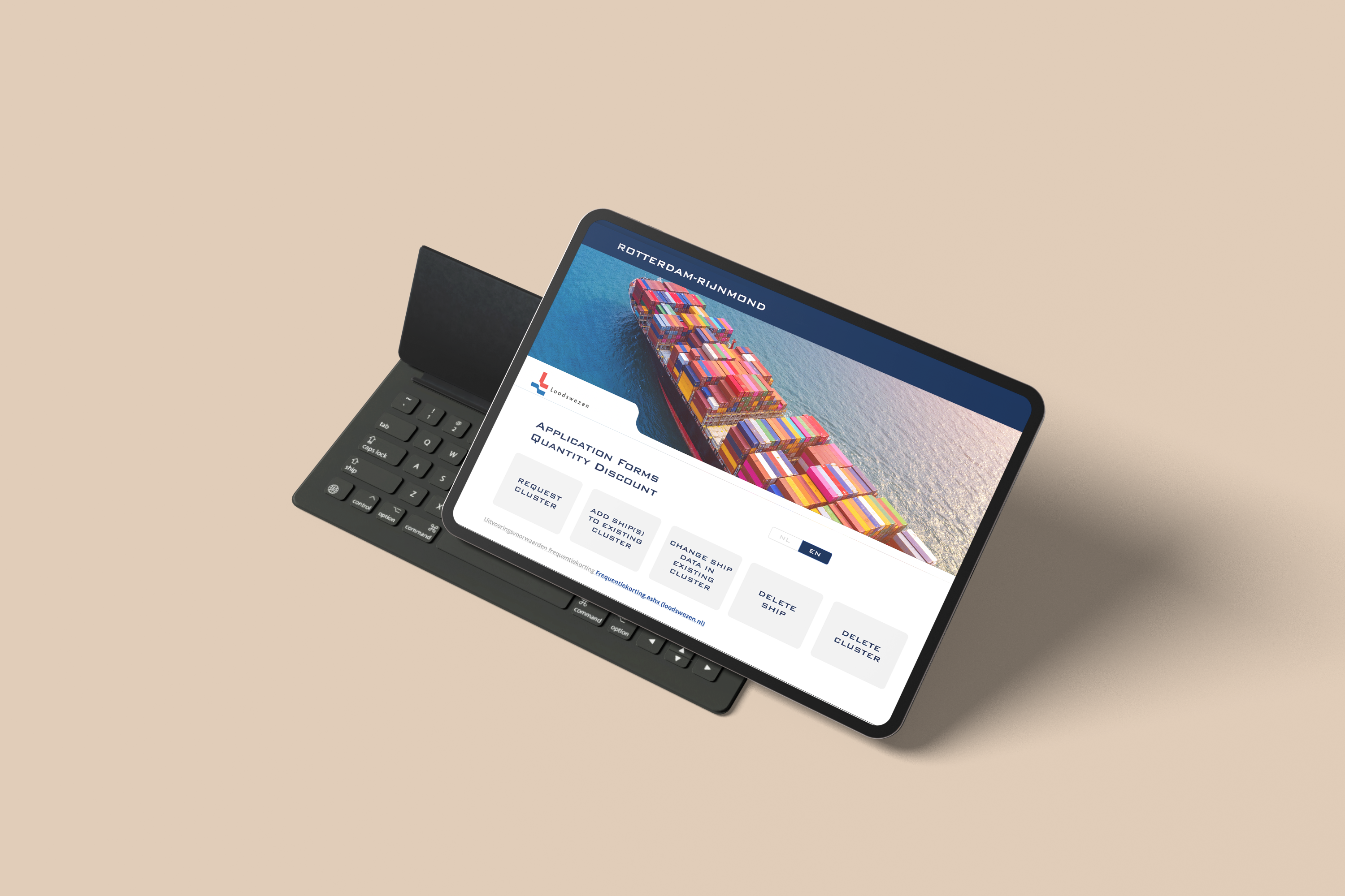
Loodswezen needed to modernize the way customers submitted information related to ships and port services. The existing process relied heavily on Excel files exchanged through email. Customers had to understand complex operational requirements, complete the correct spreadsheet and contact the company whenever information needed to be changed. This process created friction for both sides. Customers lacked visibility and control, while employees had to manually review, organise and re-enter information without having a centralised customer history. I worked as the UX and UI designer responsible for researching the existing service, identifying the needs of customers and employees, defining the product experience and designing a responsive self-service portal. The final concept transformed a fragmented spreadsheet-based process into a guided digital experience where customers could submit, review and manage requests, while employees could access structured and consistent information.
The initial request was to create a webpage containing digital versions of the existing forms. However, early research showed that simply transferring the Excel fields to a website would preserve many of the original problems. The experience depended on customers knowing which form to request, how to complete it and who to contact when changes were needed. The process also generated repeated emails, manual data handling and limited traceability for Loodswezen employees. There were therefore two connected challenges: Customers needed a clear and independent way to submit and manage shipping information without understanding the company’s internal processes. Employees needed accurate, structured and accessible data that reduced manual administration and provided a reliable history of customer activity. This led to the central design question: How might we turn a complex, manually managed form process into a guided self-service experience that gives customers more control while improving the quality and accessibility of information for employees?
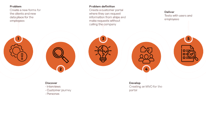
I used the Double Diamond framework to structure the project around discovery, definition, development and delivery.
Rather than beginning with interface design, I first investigated the complete service surrounding the forms. I examined how customers received, completed and returned spreadsheets, how employees processed the information and where delays or errors occurred.
The process included interviews and questionnaires with customers and employees, empathy mapping, analysis of the existing customer journey, problem definition, competitive research, user-flow creation, low-fidelity wireflows, interactive prototyping and iterative testing.
I documented the main decisions and translated validated requirements into user stories and scoped development tickets. During implementation, I collaborated closely with two front-end engineers, clarified interaction behaviour and reviewed the developed experience against the approved designs.
This approach allowed the team to design the complete workflow rather than a collection of isolated form screens.
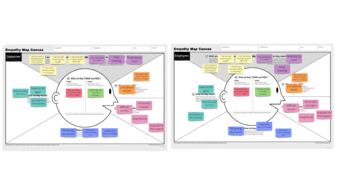
The discovery phase involved two main user groups: customers submitting ship-related requests and employees receiving and processing the information.
I conducted interviews and collected feedback through separate questionnaires for each group. The research revealed several recurring pain points.
Customers found the forms long and difficult to understand, were uncertain about which information was required and depended on email or telephone support when they needed to make changes. They also lacked a clear view of previous submissions.
Employees experienced incomplete or incorrectly completed forms, repeated communication with customers and significant manual work when organising and transferring information.
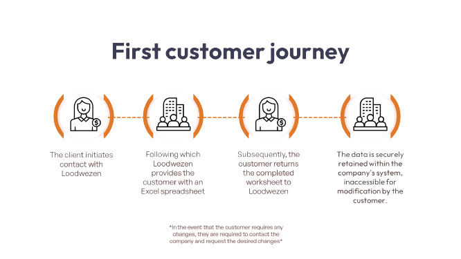
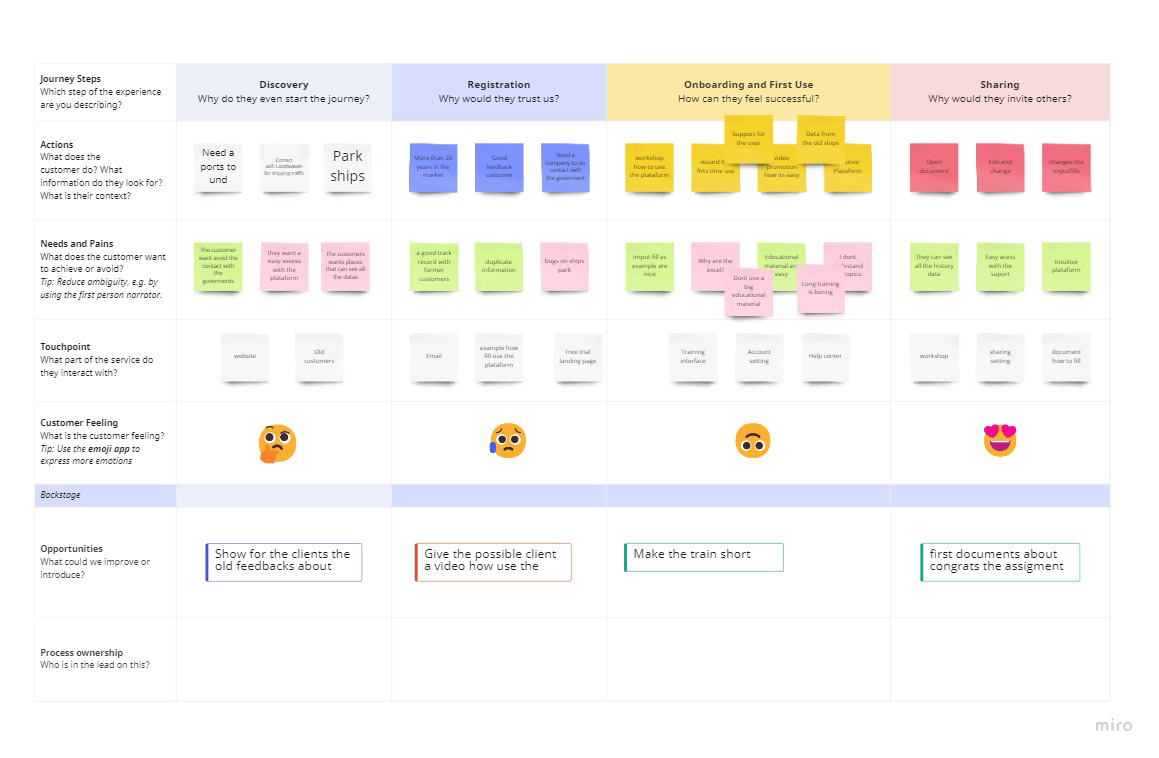
I synthesised these findings into empathy maps and mapped the existing customer journey. This made the operational gaps visible: the process moved repeatedly between the customer and the company, while the customer lost access to the information after returning the spreadsheet.
The research showed that the project needed to become more than a digital form. It required a customer portal with guided tasks, reusable information, clear progress and a centralised record of requests.
The research produced four principles that guided the solution:
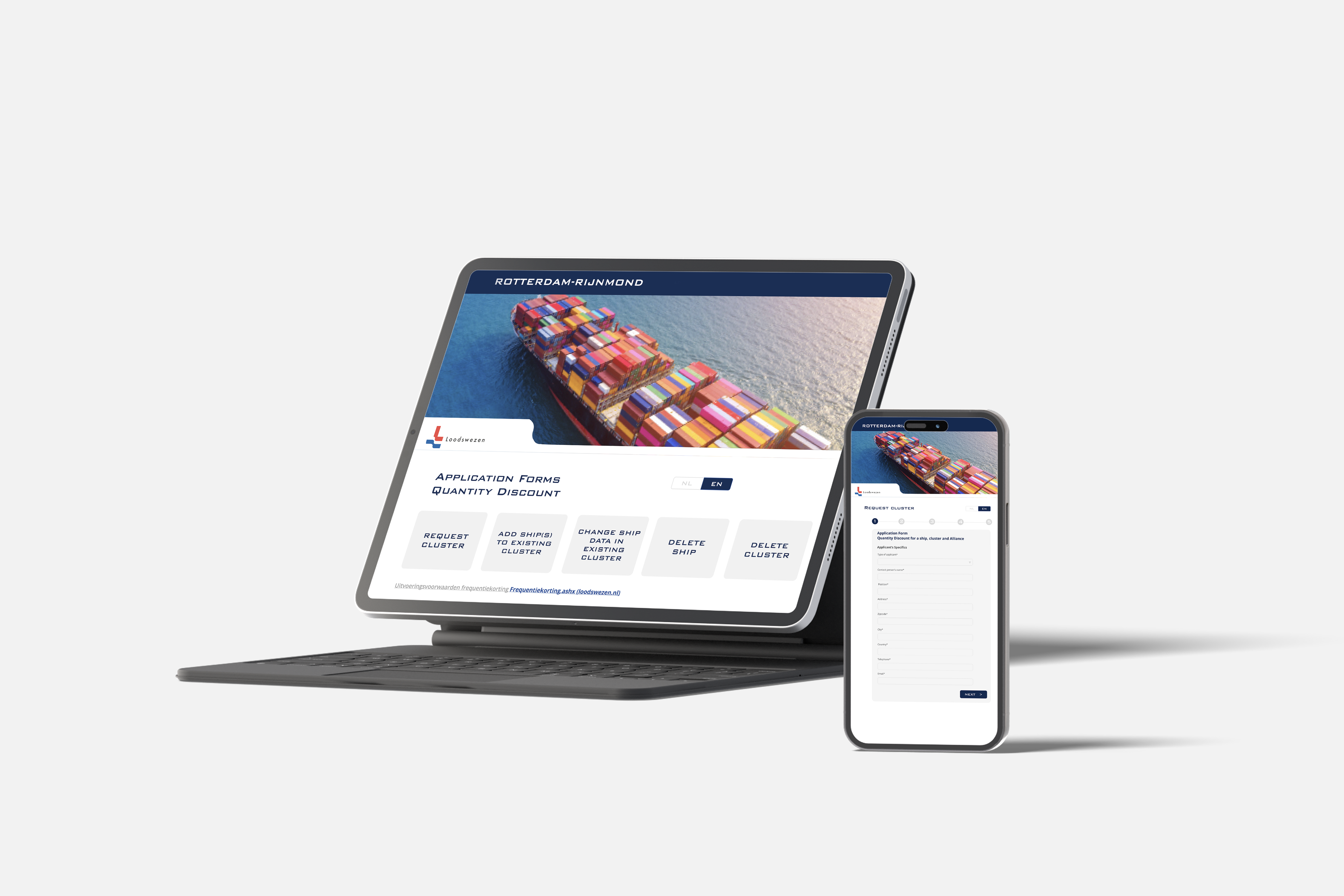
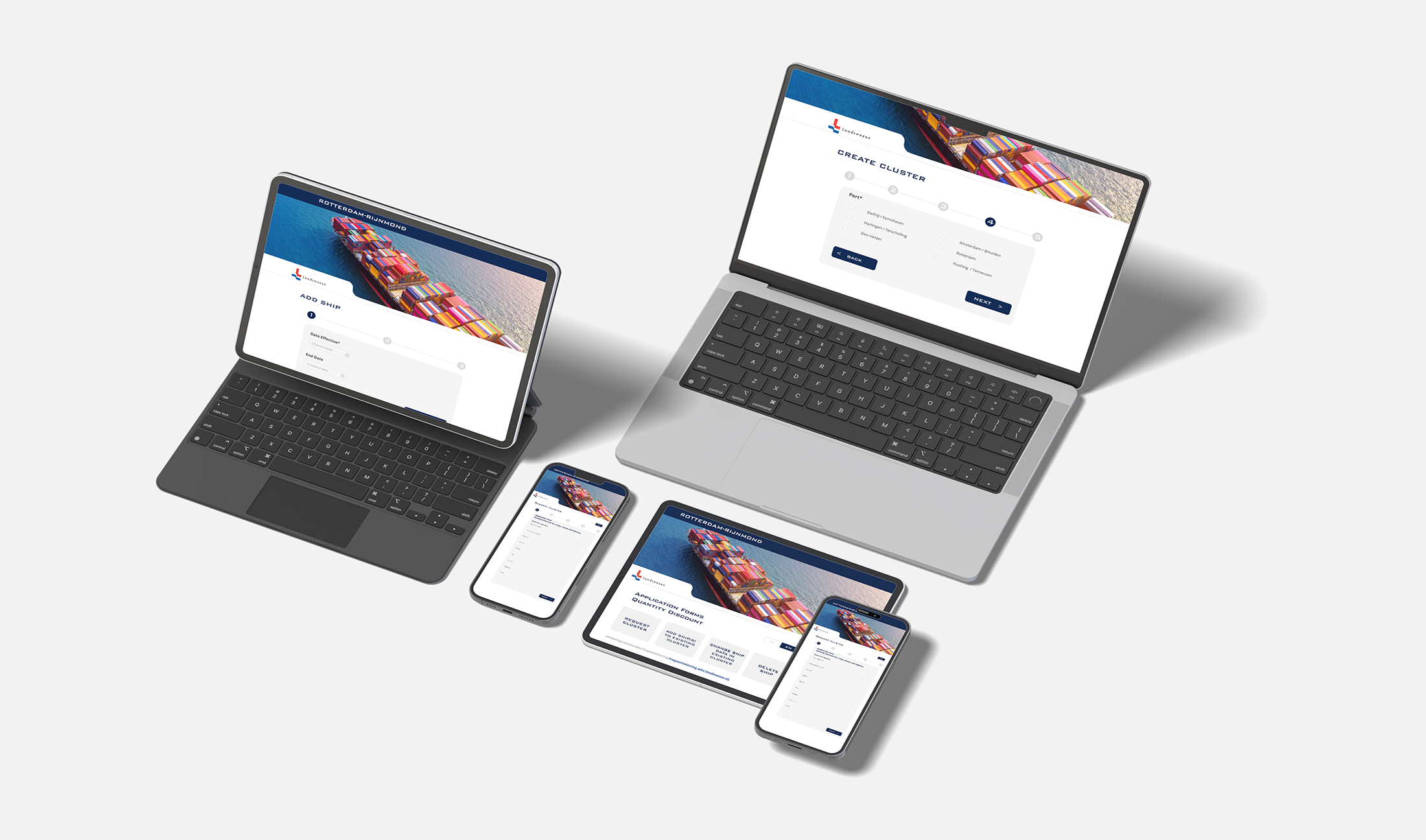
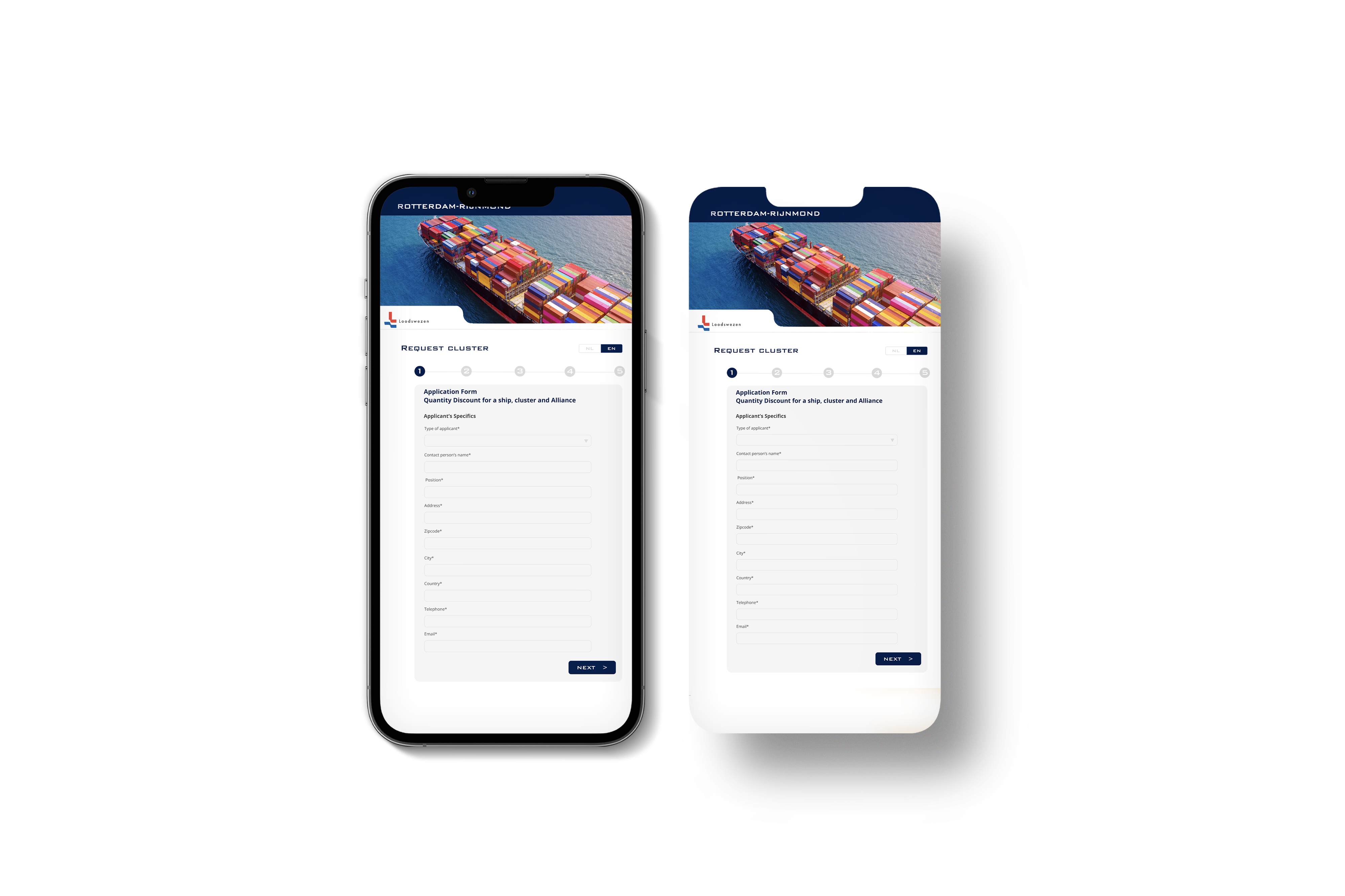
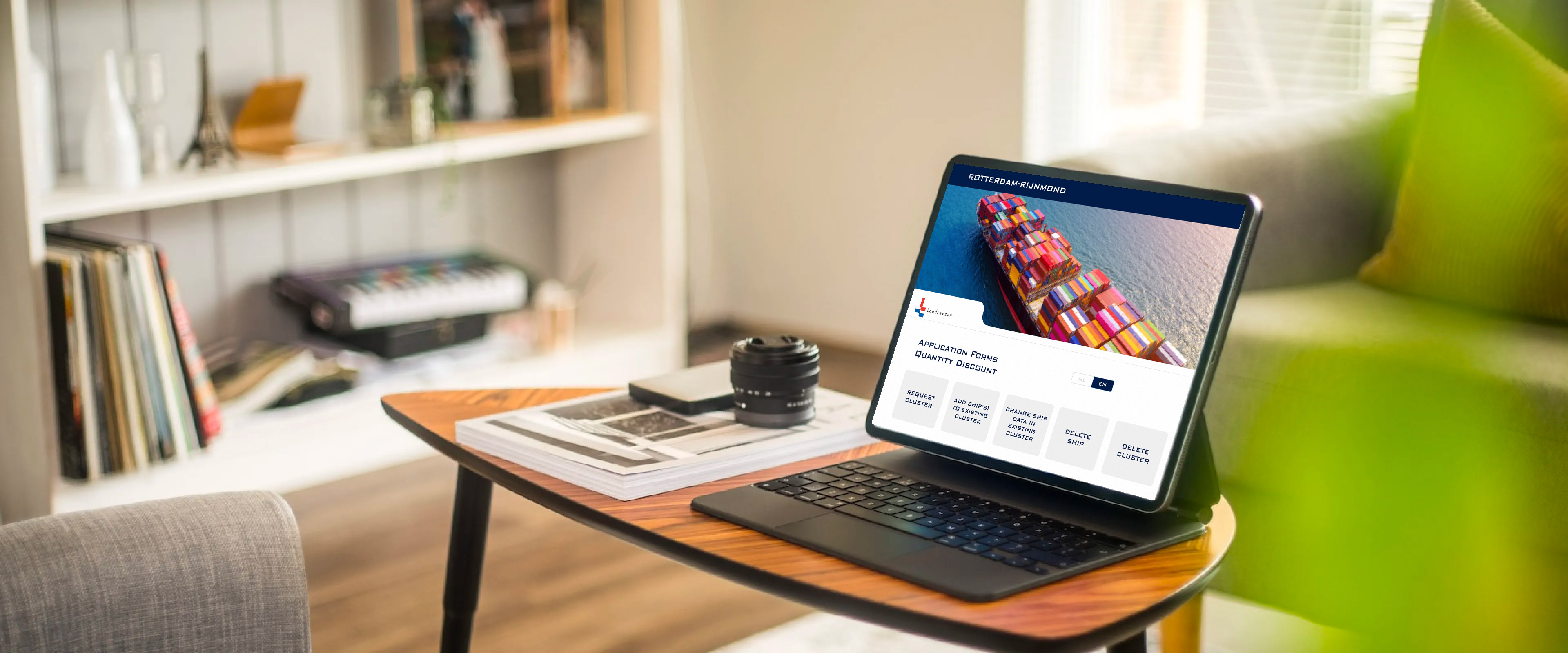
I designed a responsive self-service portal that replaced the fragmented spreadsheet workflow with a series of clearly defined customer tasks. From the main dashboard, users could select actions such as requesting a new cluster, adding ships to an existing cluster, changing ship information or deleting records. Each task was represented as a distinct entry point, helping customers identify the correct process without needing to understand Loodswezen’s internal structure. For complex submissions, I introduced a multi-step wizard. Long forms were divided into manageable stages, with visible progress, contextual instructions and logical grouping of related fields. This reduced cognitive load and made it easier for users to understand what information was required at each moment. I also defined the navigation and decision flows connecting the dashboard, forms, review states, validation messages and confirmation screens. This ensured that customers always understood where they were, what remained to be completed and what would happen after submission. The responsive interface was designed to work across desktop, tablet and mobile devices while maintaining the clarity required for data-heavy workflows. For Loodswezen, the concept created a foundation for storing submissions in a structured system rather than processing disconnected spreadsheets. This made customer information easier to access, review and maintain.
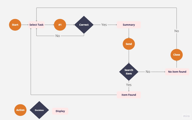
User Flow
Following extensive research andanalysis, our project began with a vital step: crafting a user flow diagram.This blueprint serves as the foundation, offering a structured path for users,ensuring a cohesive experience, and shaping the platform's design andfunctionality for a successful
project execution
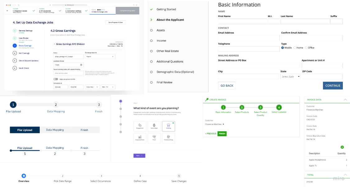
Reference inspiration After establishing the user flow, the next phase involved conducting a competitive analysis and developing visual references for the project. The project's initiation leveraged a UI wizard tool, particularly effective for guiding users through form-based processes, ensuring clarity about steps and progress
The original scope focused on placing forms on a webpage. Based on the research, I proposed an MVP that addressed the most important user and operational problems without attempting to digitise every possible scenario at once.
The MVP centred on a responsive customer portal with:
I created wireflows combining page structure with navigation logic. These were used to evaluate the complete journey before investing in high-fidelity visual design.
Lower-priority functionality was documented for later iterations. This allowed the team to deliver a coherent core experience while keeping the product architecture scalable.
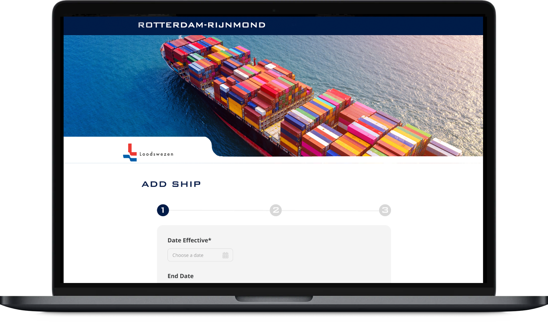
During implementation, I worked closely with two engineers to translate the MVP into a functional product. I prepared scoped tickets containing user stories, product requirements, interaction behaviour and acceptance criteria.
Rather than handing over static screens, I explained how states and features were connected, including navigation paths, validation behaviour, responsive changes and expected outcomes after each action.
Regular communication with the engineers helped resolve technical questions early and maintained consistency between the approved experience and the developed product.
The interactive prototype and redesigned journey were presented to Loodswezen for evaluation. Although the initial expectation had been a relatively simple webpage containing forms, the research demonstrated the value of a broader self-service solution.
The overall navigation and product direction received positive feedback during the first review. Stakeholder feedback focused mainly on refining specific input fields rather than changing the core experience, supporting the underlying information architecture and workflow.
These adjustments were incorporated into the next iteration before development continued.
The project reframed a manual administrative request as a service-design challenge. Instead of reproducing the existing spreadsheets digitally, the proposed portal addressed the causes of customer confusion and internal inefficiency.
The resulting experience gave customers a clearer way to complete complex tasks and provided Loodswezen with a more structured approach to collecting and managing information.
The project reinforced the importance of investigating the service surrounding an interface. The most valuable design opportunity was not the visual redesign of the forms, but the restructuring of the complete journey.
It also demonstrated that an MVP should be small enough to deliver, but complete enough to solve a meaningful user problem. Early interviews, journey mapping and wireflows helped the team challenge the original brief and propose a solution based on evidence rather than assumptions.
For the portfolio page, place the interview notes, empathy maps, original journey, user flow and low-fidelity wireflows before the final mock-ups. Annotate each image with the insight or decision it represents, and finish with links to the live portal or interactive prototype where disclosure is permitted.