
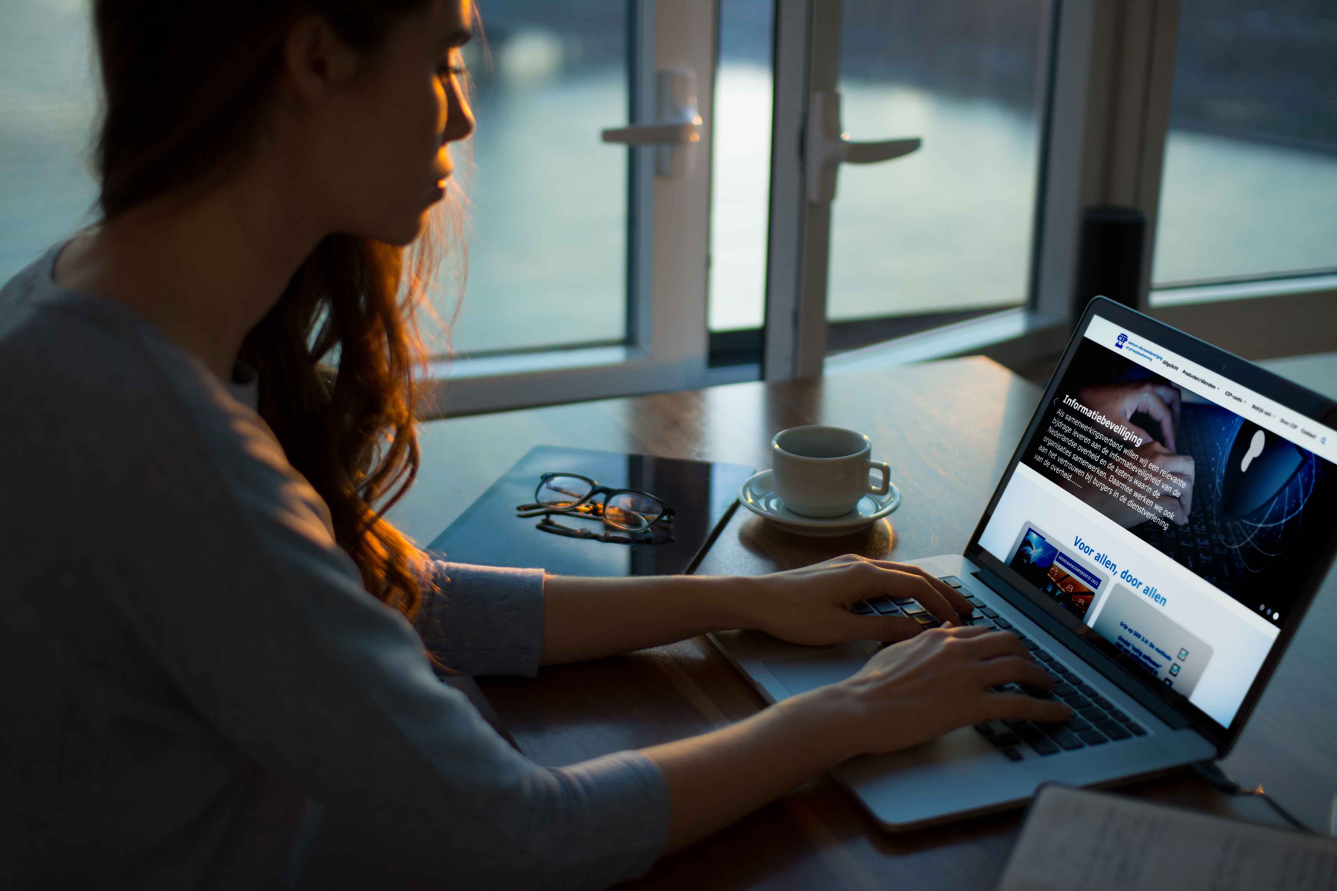
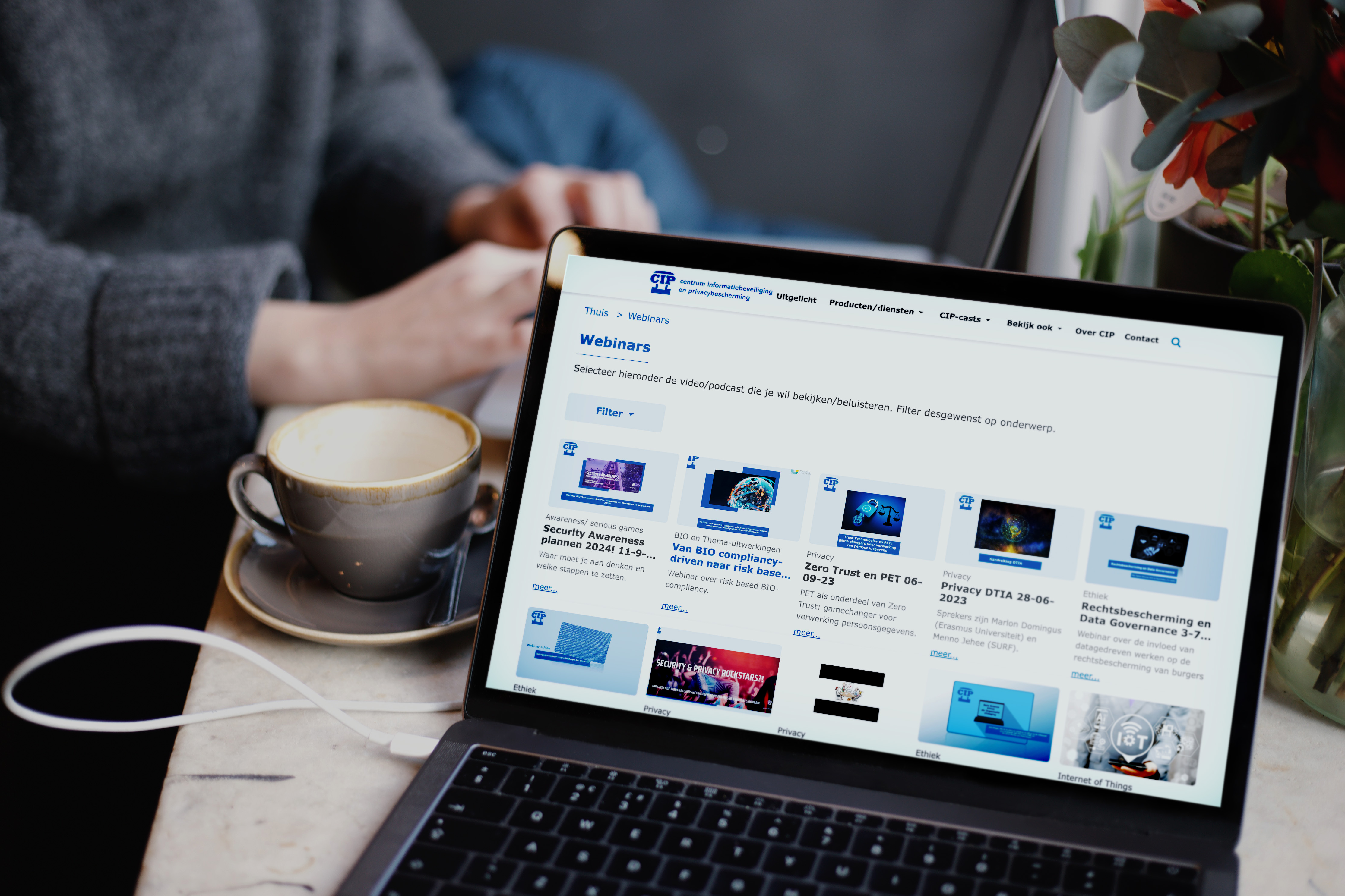
CIP had an outdated website that appeared to be stuck in the 2000s. It featured an unappealing layout, excessive information cramped onto a single page, and lacked proper hierarchy, resulting in user confusion during navigation. To address these issues, a significant redesign project was undertaken to modernize the platform and enhance its usability.
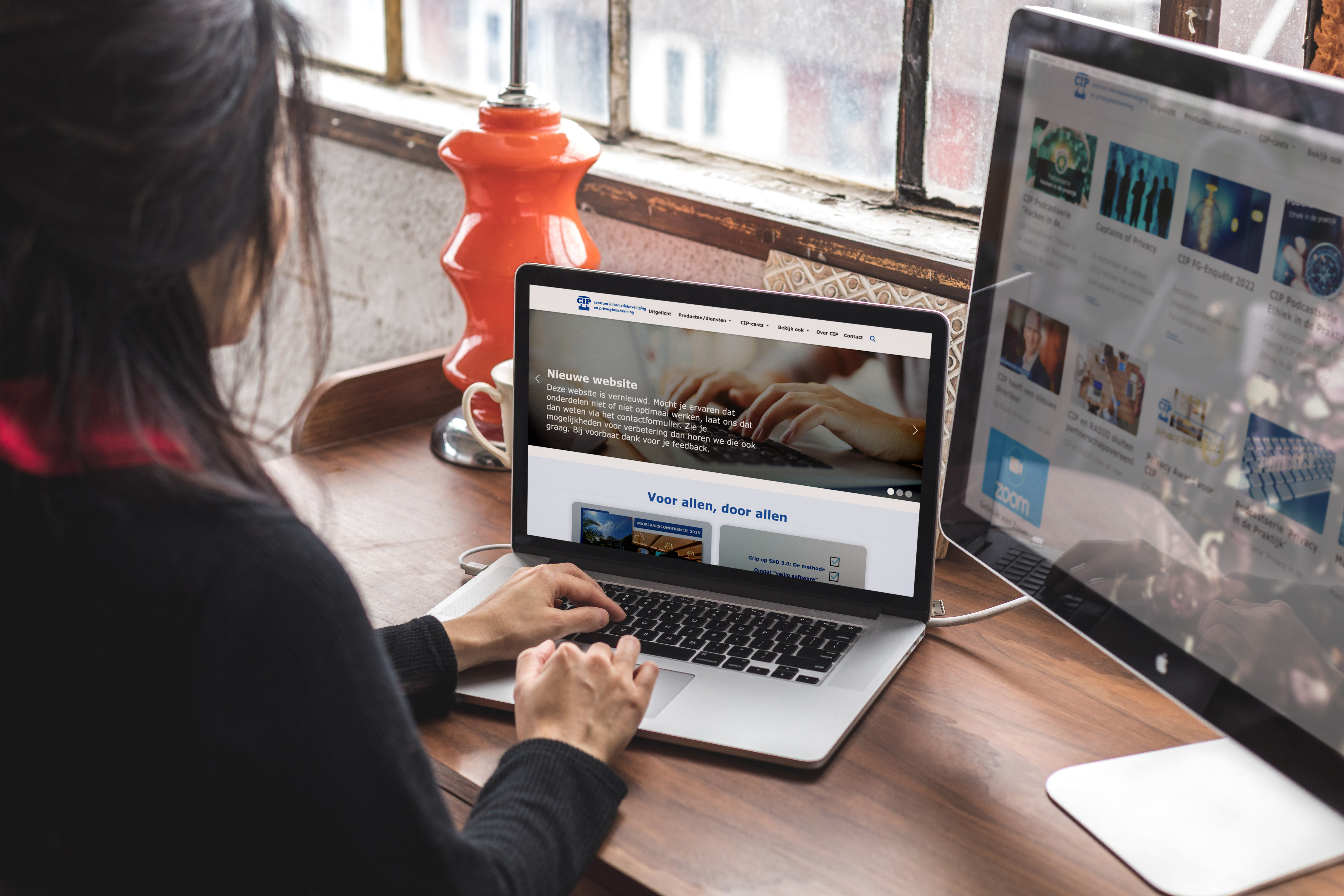
The primary objectives for the CIP website redesign were as follows: 1. Revamp the navigation: Develop a new, user-friendly navigation system that improves ease of use and aids users in finding desired information efficiently. 2. Modernize the overall look: Transform the visual appearance of the website to give it a contemporary and visually appealing design. This includes updating the layout, color scheme, typography, and overall aesthetics to create a more engaging user experience.By achieving these goals, the aim was to create a fresh and updated website for CIP that aligns with modern web design standards and provides a seamless and enjoyable browsing experience for its users.
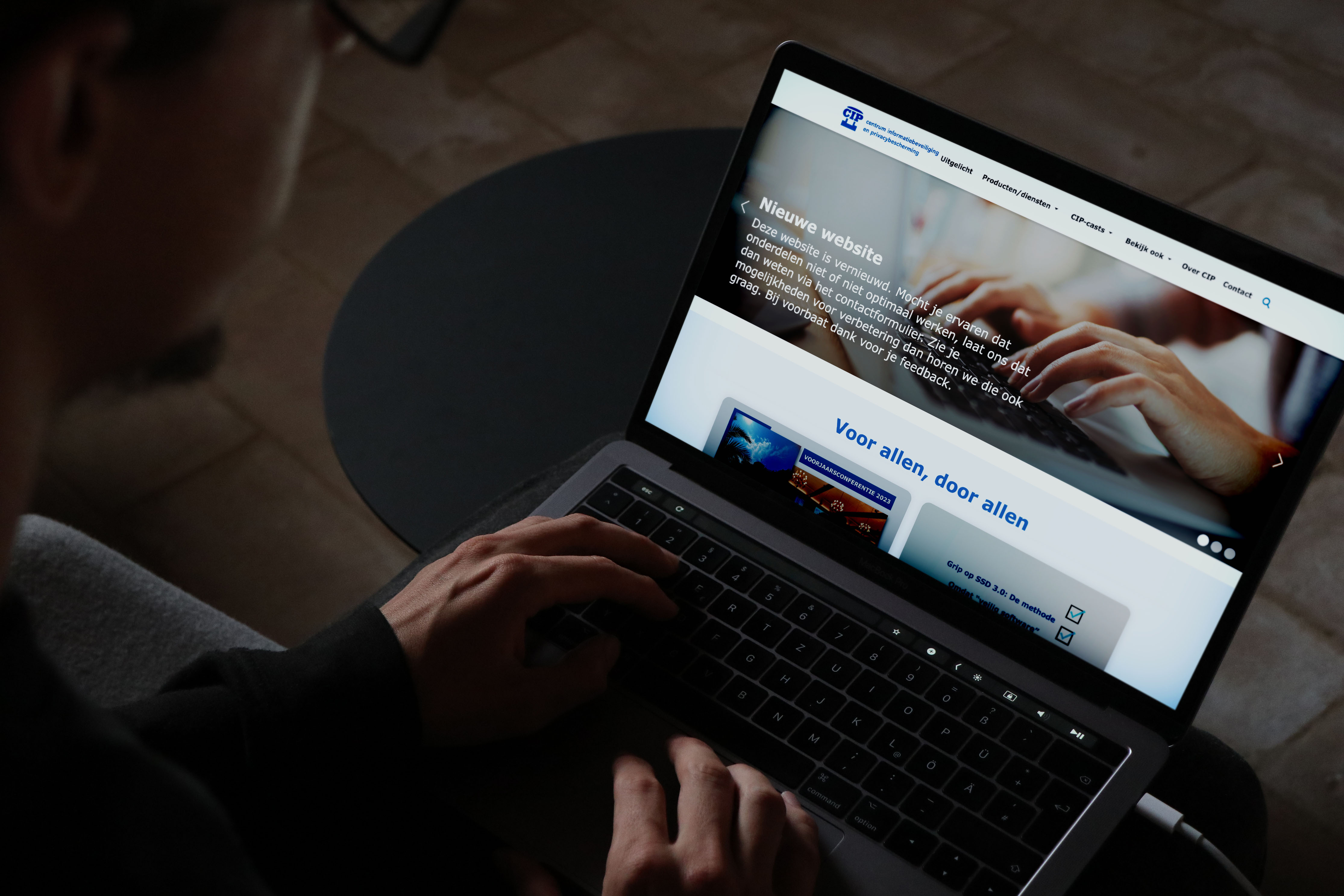
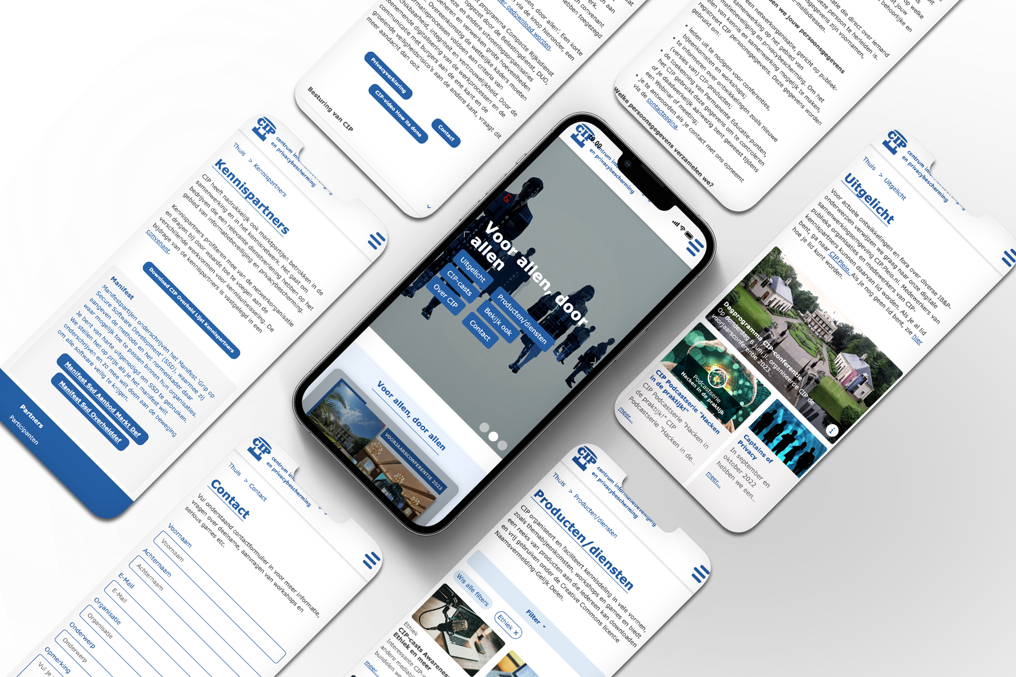
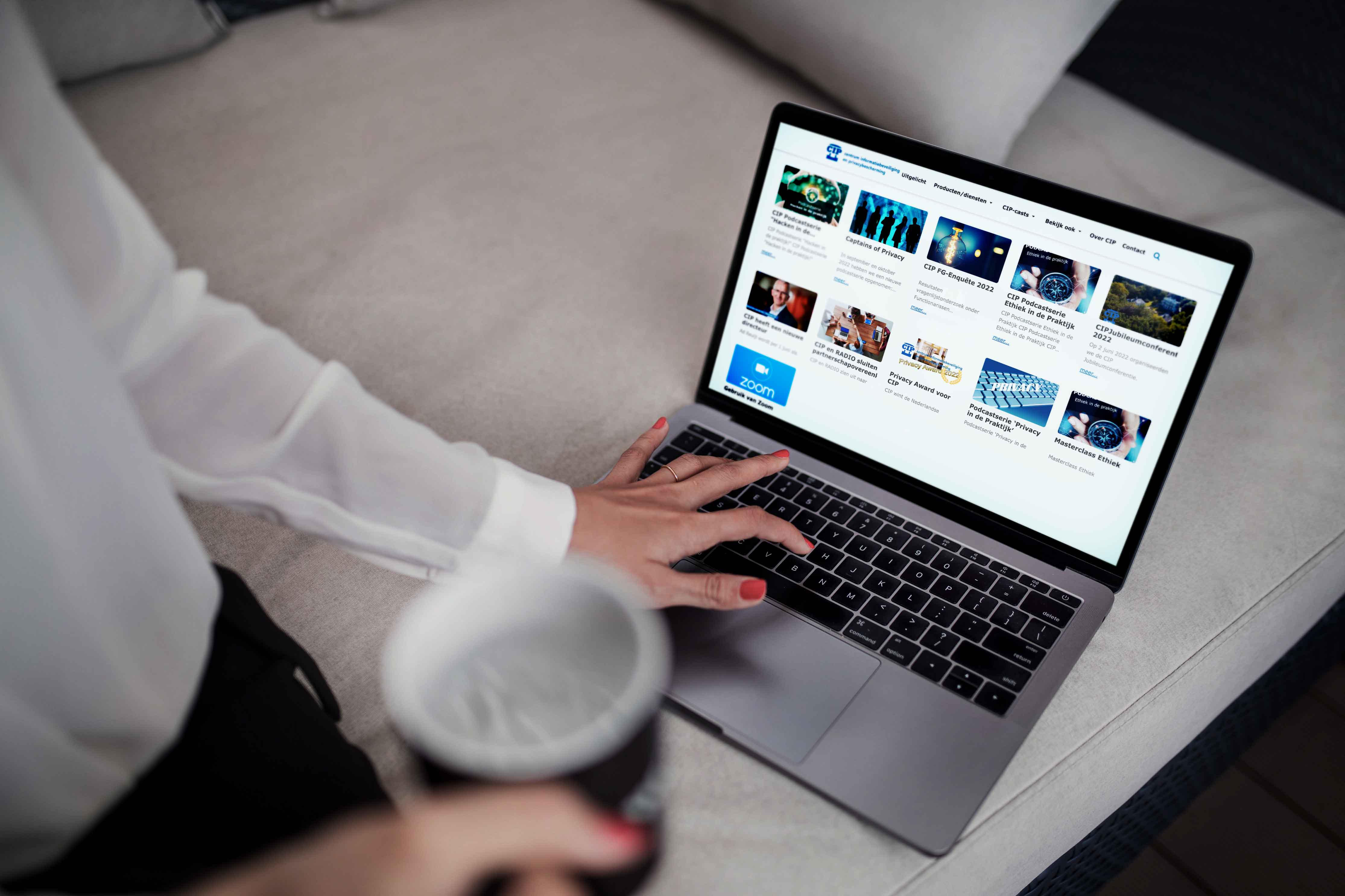
Working on the CIP project posed a significant challenge. The product manager provided a brief with a sole requirement: to create a modern-looking website with a new navigation system while retaining the existing content. I was given the freedom to start from scratch and build a completely new website. It was an exciting opportunity, but I also recognized the responsibility that came with it, as Spider-Man famously said, "With great power comes great responsibility."
To begin the project, I had a lot of work ahead of me. During the briefing meeting, I asked several important questions to gather information and set the project direction. These questions included: Who is the target audience for the website? Are there similar websites in the market? What are the user expectations for the website? Did the client provide any references or examples?
Based on the responses, or lack thereof, I divided the workflow into five steps:
1. Map: I conducted a thorough analysis to map out the website's structure, content, and user flows.
2. Sketch: I began sketching out design ideas and layouts to visualize the overall look and feel of the website.
3. Decide: I made decisions regarding the design direction, color schemes, typography, and other visual elements.
4. Prototype: I created interactive prototypes to demonstrate the functionality and user experience of the website.
5. Test: I conducted user testing sessions to gather feedback and validate the design choices.
By following these steps, I aimed to create a well-thought-out and user-centric website for CIP that met their goals of a modern look and improved navigation.
For this project, having only a two-week design phase posed a time constraint. To make the most of the available time, I divided the weeks into five key phases:
Week 1:
- Monday to Wednesday: Mapping
During the first three days of Week 1, I focused on conducting a comprehensive analysis and mapping out the website's structure, content, and user flows. This involved gathering information, conducting research, and creating a clear plan for the website's organization.
- Thursday and Friday: Sketch
The latter part of Week 1 was dedicated to sketching out design ideas and creating initial layouts. I explored different concepts, wireframed key pages, and worked on creating a visual representation of the website's structure.
Week 2:
- Decide - Wednesday
At the beginning of Week 2, I focused on making important design decisions. This included finalizing the color schemes, typography, visual elements, and overall design direction for the website.
- Thursday and Friday: Test
The last two days of the design phase were allocated for user testing. I conducted usability testing sessions to gather feedback, evaluate the user experience, and identify any areas for improvement or adjustments.
By allocating specific timeframes for each phase, I aimed to efficiently utilize the two-week design phase, ensuring that key activities such as mapping, sketching, decision-making, and testing were conducted within the given timeframe.
Gathering Insights:
After reviewing the recordings from the user interviews and engaging in quick conversations with the CIP website, I proceeded to conduct affinity mapping. This process involved synthesizing the identified pain points and grouping them under common themes and platform features. By doing so, we gained a deeper understanding of the challenges faced by users.
Must-haves for Principal Points:
We defined the essential requirements for three key areas:
- Easy to search: Ensuring that the website provides a user-friendly search functionality, allowing users to quickly find the information they need.
- Separation of product types: Organizing the platform in a way that clearly distinguishes between different types of products or services offered by CIP.
- User connection impact: Designing the website to create a strong connection between users and CIP, fostering engagement and interaction.
Sitemap:
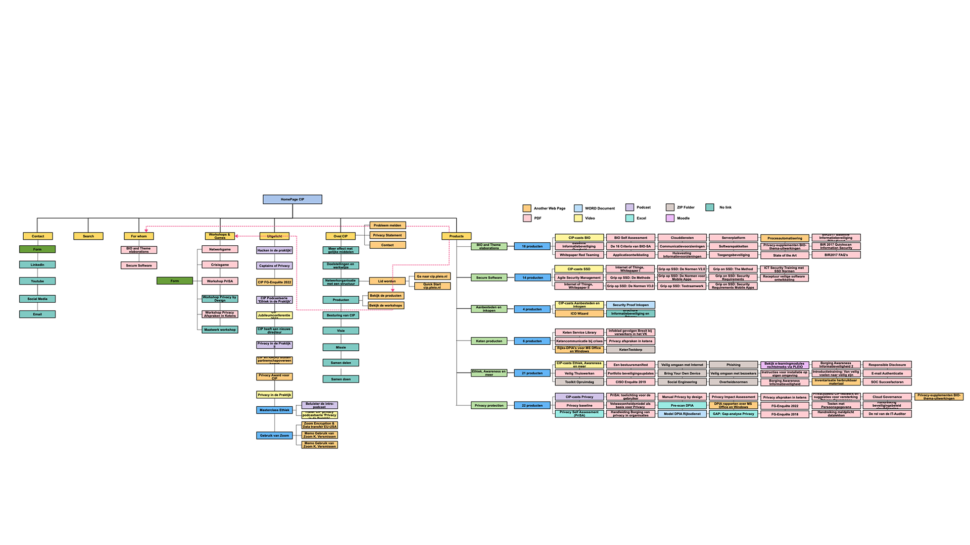
To gain a comprehensive understanding of the current state of the website, I created a sitemap. This involved mapping out the entire site, identifying the main challenges, and pinpointing key areas of information. By visualizing the website's structure and content, we gained insights into the organization and hierarchy of information, which helped inform the redesign process.
By conducting these mapping exercises, we were able to gather valuable insights, identify user pain points, and gain a clear understanding of the current website's structure. This information provided a solid foundation for the subsequent design and improvement efforts.
Prioritization of issuesI took the extra step of categorizing these problems are the most important and which ones needed priority redesign, for this, I made a small excel with the main things that I needed to change.
Based on the problems identified during the mapping phase, I focused on addressing these pain points by generating potential solutions through wireframes. The key objectives of the wireframes were:
- Reducing the number of clicks for the users: Ensuring that users could access the desired information or perform actions with minimal effort and navigation steps.
- Easy access to other pages: Designing clear and intuitive navigation elements that would enable users to easily move between different sections or pages of the website.
- Accessibility and clear information for everyone: Paying attention to the usability and readability of the content, making sure it was accessible to all users, regardless of their abilities or devices used.
-Establishing a clearer visual form hierarchy: Grouping related fields and information to create a more organized and structured interface, allowing users to quickly understand and interact with the content.
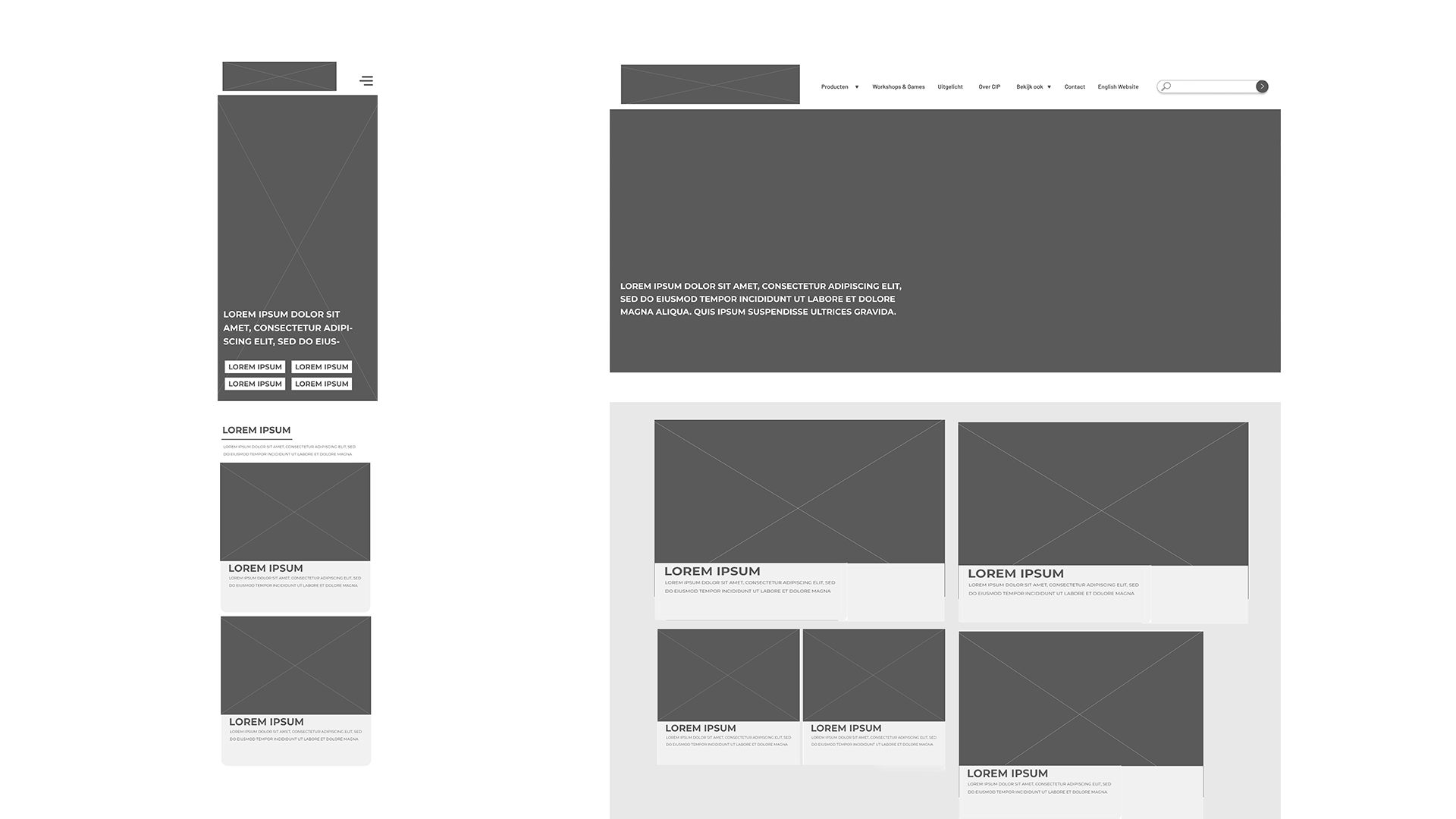
To gather feedback and insights, I created basic wireframes that depicted the proposed layout and functionality of the website. These wireframes served as a starting point for discussions and allowed stakeholders and users to provide valuable input and suggestions for further improvements.
The wireframes were intentionally kept simple and focused on the core aspects of the user interface, enabling rapid iterations and feedback gathering to inform the subsequent design phases.
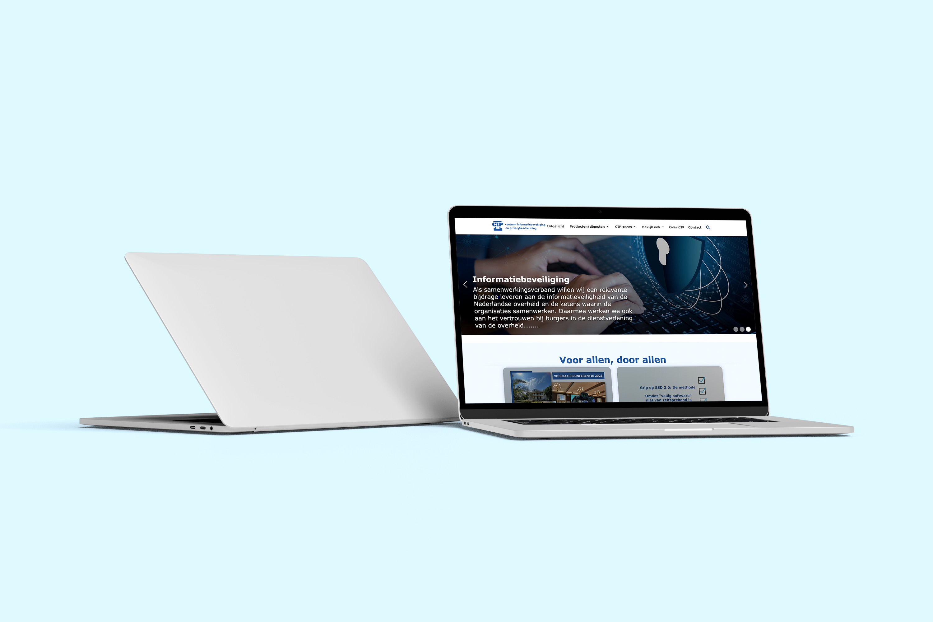
Following the decision-making step, I proceeded to develop a Minimum Viable Product (MVP) for the platform, incorporating the ideas generated in the previous stages and the gathered information. I created step-by-step designs for all the pages of the website, including the home page, product page, contact page, and more.
One significant solution I implemented was prioritizing the mobile version of the prototype. Through my research, I discovered that the majority of platform access occurred on mobile devices. Therefore, I focused on creating a mobile-first design approach to ensure optimal user experience for mobile users. I utilized Figma to develop high-fidelity mockups and then employed prototyping tools to showcase the design to clients and conduct user testing.
Throughout this process, I closely collaborated with the Front-End team to address any missing interactions that were not initially covered in the high-fidelity mockups. This close collaboration allowed us to refine and implement all the necessary design elements and interactions to create a seamless user experience.
Additionally, I conducted a thorough UX review of each Front-End ticket that was implemented to ensure that the designs were accurately translated into the final product. This review process helped ensure that the implemented front-end components aligned with the original designs before they were launched live.
By creating a prototype and closely collaborating with the Front-End team, we were able to ensure that the final product met the design specifications, provided an optimal user experience, and achieved the desired goals of the project.
5. Test
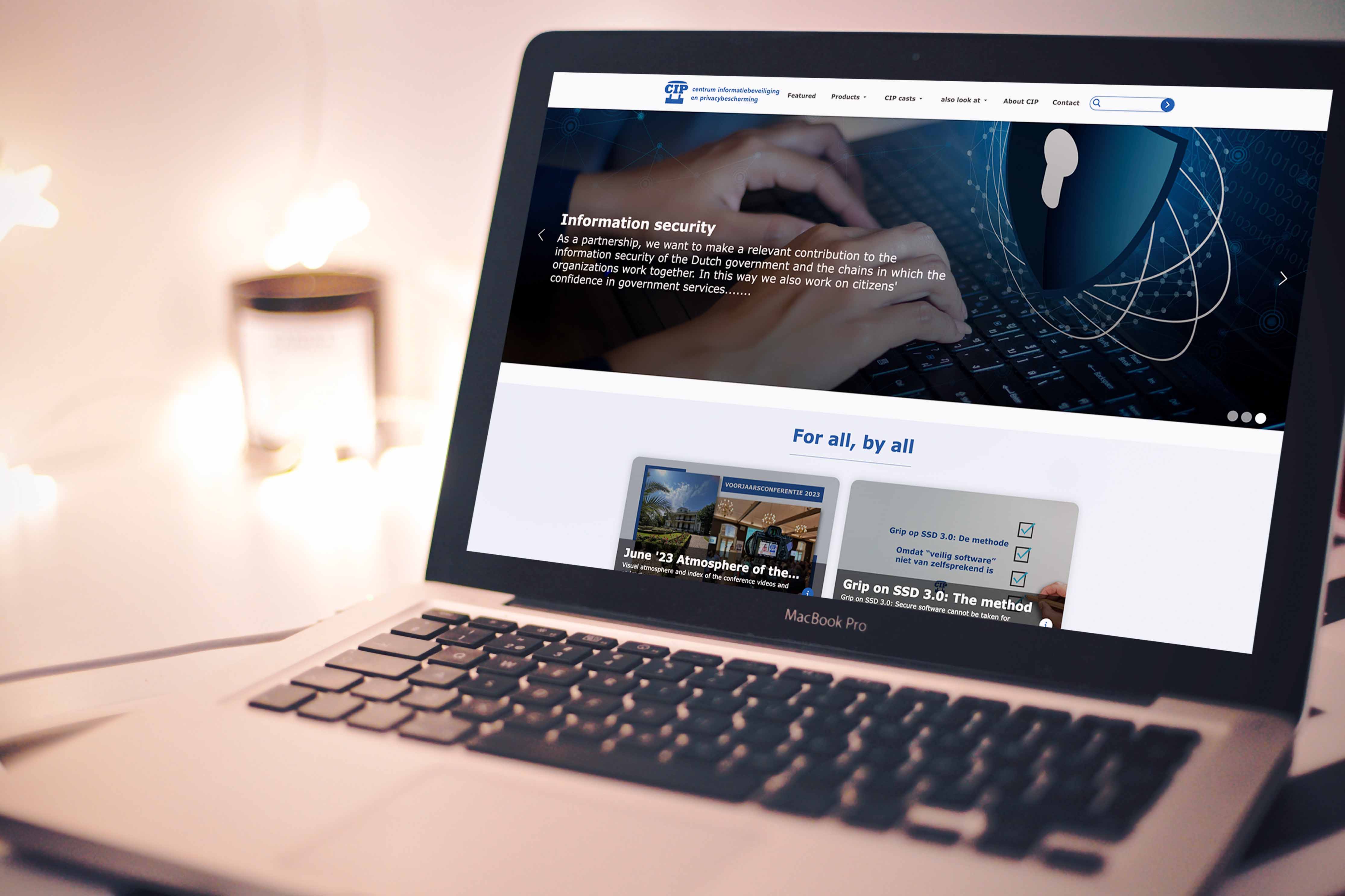
Once the prototype was completed, we presented all the new ideas, solutions, and design concepts to CIP. We conducted testing sessions with both CIP and five potential clients to gather valuable feedback. During these sessions, we took detailed notes and compiled the feedback to identify areas for improvement.
Using the feedback received, we created a new Excel sheet to track and implement the necessary changes based on the testing results. This allowed us to refine the prototype and address any usability or functionality issues identified during the testing phase.
Throughout the project, I gained several key takeaways from this experience:
By embracing these takeaways, we can continue to enhance the website's usability, address user needs, and deliver a product that effectively meets CIP's requirements.
See the website in life https://cip-overheid.nl/

