
CIP Website
The brief
[DRAFT] How might we give CIP a modern website with a navigation that helps people find information quickly?
By achieving these goals, the aim was to create a fresh and updated website for CIP that aligns with modern web design standards and provides a seamless and enjoyable browsing experience for its users.
CIP: from one crowded page to a structure people can navigate
CIP supports Dutch public organisations with information security and privacy. Its site had grown into a single page of everything. In a two-week design phase I mapped the content, restructured it, and designed a mobile-first website with a navigation and component system that could hold it.
The shipped homepage, 2023. Move your pointer over the image: the old site’s content still wants to spill out.
Challenge
Too much information on one page and no hierarchy. Visitors got lost before they found anything.
Constraints
Two weeks of design. Keep all existing content.
My role
UX/UI designer, the only designer on the project.
Outcome
Tested with CIP and five potential clients, refined, built with the front-end team. Live at cip-overheid.nl.
01 — The brief
The brief asked for a new look. The real problem was the structure underneath
The brief from the product manager was one line long. A new skin over the old structure would have looked better and worked the same.
So before I drew anything, I asked the questions the brief didn’t answer. Ask them yourself.
Brief · CIP website
Modern look. New navigation. Keep all the content.
From: product manager
Not in the briefFilled in week one, from the interview recordings.
Not in the briefLeft for research to answer.
Not in the briefBecame the affinity map in section 03.
Not in the briefAnother gap for week one to fill.
0 of 4 asked · Tap a question.
02 — Role & process
One designer, two weeks, five steps
The missing answers shaped the plan: five steps squeezed into ten working days.
01 · Mon–Wed, week 1
Map
A sitemap of the whole old site, its content and its flows. Interview recordings reviewed and grouped into pain points.
02 · Thu–Fri, week 1
Sketch
Paper sketches and first wireframes, aimed at fewer clicks and a clearer hierarchy.
03 · Mon–Wed, week 2
Decide
Problems prioritised in a small spreadsheet. The navigation model and the visual direction chosen.
04 · Mon–Wed, week 2
Prototype
High-fidelity, mobile-first screens in Figma, linked into a prototype for testing.
05 · Thu–Fri, week 2
Test
Sessions with CIP and five potential clients. Every note went into one change list.
I owned
I collaborated on
The team owned
03 — Understanding the ecosystem
A site sits between an organisation, its content and the people who need it
The map I used to reason about the project, one layer at a time.
01 / 07 · The centre
CIP
Centrum Informatiebeveiliging en Privacybescherming: a public-sector organisation that helps government bodies work securely and protect privacy.
02 / 07 · Who it serves
Public organisations
Municipalities, provinces, water authorities and central government. Different sizes, similar questions.
03 / 07 · What it offers
Five kinds of content
Products, knowledge, events, news and a community. Each is useful. On the old site they all competed on the same page.
04 / 07 · Who actually visits
People with a job to do
Security officers, privacy officers, IT specialists and managers. They come in with a question, often on their phone.
05 / 07 · Relationships
Everyone needs a bit of everything
Every audience touches every content type. A menu with one door per audience would duplicate the whole site.
06 / 07 · Pain points
Where the old site broke
Four pain points came out of the interview recordings and affinity mapping, P1 to P4 on the map.
07 / 07 · Must-haves
Pain points become requirements
Three must-haves came out of the synthesis: easy to search, clearly separated product types, and a stronger connection between users and CIP. A fourth came from me: clear hierarchy, mobile first.
Decision Design around questions, not around CIP’s internal departments.
Different people, the same first move: find the right thing fast
A needs map built from the affinity-mapping clusters. The archetypes are generalisations, not real people.
| Need | Security officer | Privacy officer | IT specialist | Manager | Design answer |
|---|---|---|---|---|---|
| Find a specific product fast | Search in the header, on every page | ||||
| Know what kind of thing it is | Content types separated in the main nav | ||||
| Explore a topic | Shared themes across every type | ||||
| Keep up with what changed | News & events as their own section | ||||
| Connect with CIP and peers | Community and contact always one tap away |
Every archetype starts with the same move: find it fast.
04 — Restructuring information
Same content, new architecture
The brief said to keep the content, so the change had to come from the structure. The same 27 items, reorganised from one crowded page into a system you can navigate.
What are you working on?
Search products, knowledge, newsSearchBrowse by theme
Latest
01 / 07 · Existing structure
Everything, all at once
I started by sitemapping the old site. Products, articles, news and events sat side by side on one long page, with nothing to say which mattered or what type each one was.
02 / 07 · Content complexity
The inventory, pulled apart
Laid out as an inventory, the problem became visible. Some items repeated, others were orphaned, and none carried a type or topic you could navigate by.
03 / 07 · Clusters
Topics emerge
Affinity mapping grouped the items by what they were about. Every cluster turned out to hold a mix of tools, explanations and updates.
04 / 07 · New grouping
Separate the types
The must-have made concrete. Products, knowledge, and news and events each get their own section, so you always know what kind of thing you’re looking at.
05 / 07 · New hierarchy
Themes connect them
Separating types risks building silos. So the topics stay as a shared layer: every item has one type and belongs to one or more themes. It’s a grid, not a tree.
What if? A theme page gathers every type. One tag gives you a whole landing page.
06 / 07 · New navigation
Types in the menu, themes as filters, search everywhere
The main navigation names the types. Inside each section, themes work as filters. Search sits in the header on every page: three ways in, one structure.
07 / 07 · Final experience
A homepage that routes instead of lists
Search first, then themes, then what’s new. The homepage stopped trying to show everything and started pointing people to the right place.
Items and theme names are illustrative and simplified, not CIP’s real inventory.

The real one: my sitemap of the old site, colour-coded by what each link opened. Click to enlarge.
05 — Key decisions
Two decisions
Two questions shaped everything that followed.
Question 01
What should the main navigation be organised by?
Pick one to see its trade-off.
Trade-off ·
What I chose · C
Types in the main navigation, themes as a shared filter, search on every page. It met the must-have to separate product types without cutting topics apart.
Question 02
How should a list of products look on a phone?
Pick one to see its trade-off.
Trade-off ·
What I chose · C
Compact cards with type and theme tags, and filters in a sheet behind one button. Most visits were on mobile, so this was designed for the phone first and scaled up.
06 — From lo-fi to system
From abstract thinking, to structure, to interface
Wireframes were kept simple on purpose, so stakeholders would comment on structure rather than colour. The artefacts are reconstructed to show the reasoning, except the wireframes, which are the originals.
01 / 04 · Post-its
Questions before answers
Pain points from the interview recordings went on notes, then into groups. The groups became the themes of the site. Go on, move them around.
02 / 04 · Rough map
A sitemap that was allowed to change
The new sitemap went through several versions. A separate knowledge base was crossed out, and About moved to the footer.
03 / 04 · Wireframes
Mobile first
Research showed most visits came from phones, so the wireframes started at phone width and scaled up to desktop. These are the originals.
04 / 04 · UI explorations
Three homepages, one direction
A campaign-style hero looked modern but pushed the content down. The search-first version kept the modern look and put finding first.

A · Campaign heroModern, but the content is pushed down
B · Search firstChosen
C · Index gridClear, but no search
07 — Navigation flows
How the screens connect
Three core tasks, from arrival to outcome. Each step names what the person does and how the site responds.
- 01 · Entrynavigation
Arrives from a search engine
Lands on the homepage rather than a deep link to a PDF.
- 02 · Intentuser action
Needs a DPIA template
Types it into the hero search, or taps a popular topic.
- 03 · Navigationnavigation
Main nav → Products
The section label says exactly what’s inside.
- 04 · Contentcontent
Product list
Cards with a type tag, theme edge and one line of summary.
- 05 · Decisiondecision
Which theme?
Scan everything, or narrow it down?
- 06 · Actionuser action
Filters by Privacy
The choice stays visible as a chip you can remove.
- 07 · Responsesystem response
List narrows, count updates
The new count is announced to screen readers.
- 08 · Next stepnavigation
Opens the DPIA template
A detail page with a breadcrumb, summary and download.
- 09 · Outcomesuccess
Downloads it, sees related guidance
Related items come from the same theme, so there are no dead ends.
- 01 · Entrynavigation
Homepage theme tiles
Starts from a topic, not a content type.
- 02 · Intentuser action
Wants to understand cloud risks
Has no specific document in mind yet.
- 03 · Navigationnavigation
Knowledge, filtered by Cloud
The theme tile opens Knowledge with Cloud already selected.
- 04 · Contentcontent
Explainers and guides
The same card pattern as products, with a different type tag.
- 05 · Decisiondecision
Read now, or look for a tool?
The type tag makes the difference obvious.
- 06 · Actionuser action
Reads “Sourcing requirements”
Clear hierarchy and short sections.
- 07 · Responsesystem response
Related tools appear
“Cloud checklist” is suggested from the same theme.
- 08 · Next stepnavigation
Switches to Products · Cloud
The theme filter carries over between sections.
- 09 · Outcomesuccess
Has the explanation and the tool
Two content types connected by one theme.
- 01 · Entrynavigation
Main nav → News & events
Updates have their own section instead of being mixed in with everything else.
- 02 · Intentuser action
Wants to know what changed
And whether there’s a session to join.
- 03 · Navigationnavigation
Filters to Security
Only updates relevant to their role.
- 04 · Contentcontent
Update article
The date and type are visible first.
- 05 · Decisiondecision
Read it, or attend?
A related event is linked from the article.
- 06 · Actionuser action
Opens the event
Date, format and audience at a glance.
- 07 · Responsesystem response
Sign-up form
Short, with labelled fields and inline errors.
- 08 · Next stepuser action
Submits
One primary button.
- 09 · Outcomesuccess
Confirmed, with related content
Stays connected to CIP after the task is done.
Insight Every flow ends on a page with related items from the same theme. The structure itself stops people hitting dead ends.
08 — The design system
A structure this shared needs a system to hold it
In 2023 the components lived in Figma and in the front-end tickets. For this case I made that system explicit, in CIP’s own blue and Verdana, so you can see how each part of the site traces back to a decision.
Why a system · the old site
Six ways to say “action”
Abstracted from the old site: a different button, link and card for almost every block.
Layer 1 · Foundations
A quiet base
CIP’s own blue for interaction, cool neutrals, one hue per theme, a 4px spacing grid and Verdana throughout.
Layer 2 · Tokens
Names instead of hex codes
Every colour and space gets a role name, so the front-end team and I talked about “action.primary”, not “that blue”.
Layer 3 · Components
Components emerge from the content model
Because every item has a type and a theme, one content card can show any of them. The type tag and the theme edge come straight from the model.
Layer 4 · Patterns
Three patterns cover every section
Filterable list, detail with related items, and search results.
Layer 5 · Pages
Consistency without monotony
Home, product, knowledge, news, event and contact pages are all built from the same patterns. The theme colours keep them from looking identical.
Layer 6 · Experience
One path from question to answer
A new product doesn’t need new design: it gets a type, a theme and a card, and it appears in the right places.
Answers P1
Route, don’t list
Every page points to a next step instead of showing everything.
Answers P2
The type is always visible
A tool never looks like an article.
Answers P3
Themes are the thread
One colour and label follow a topic across the whole site.
Answers P4
Calm authority, accessible by default
A trustworthy government tone, with WCAG AA as the starting point.
Foundations & tokens Click a swatch to copy it
theme.1–9 · one hue each · same lightness and chroma, only the hue changes · tint for fills, strong for edges
displayPrivacy
headingDPIA template
bodyClear sentences, 60–75 characters per line.
metaPRODUCT · UPDATED 2023
space · 4px base
radius 0 · 4 · pill for tags only · flat, raised for menus and sheets
Components
Buttons & links
DownloadRead moreRelated guidance
One primary action per view. 44px minimum touch target.
Type tags
ProductKnowledgeEventUpdated
Type is shown as text, never as colour alone.
Content card
ProductPrivacyDPIA templateAssess privacy risks before you start processing.View product →Search · filter chips
Search products, knowledge, newsSearchPrivacy ×CloudRisk
Navigation · breadcrumb
Home / Products / DPIA template
Event row · footer CTA
JUN14Privacy officer meetupOnline · PrivacyQuestions? Contact CIP →
09 — The final experience
The final experience, annotated
The shipped screens first, then the homepage rebuilt with every decision marked.
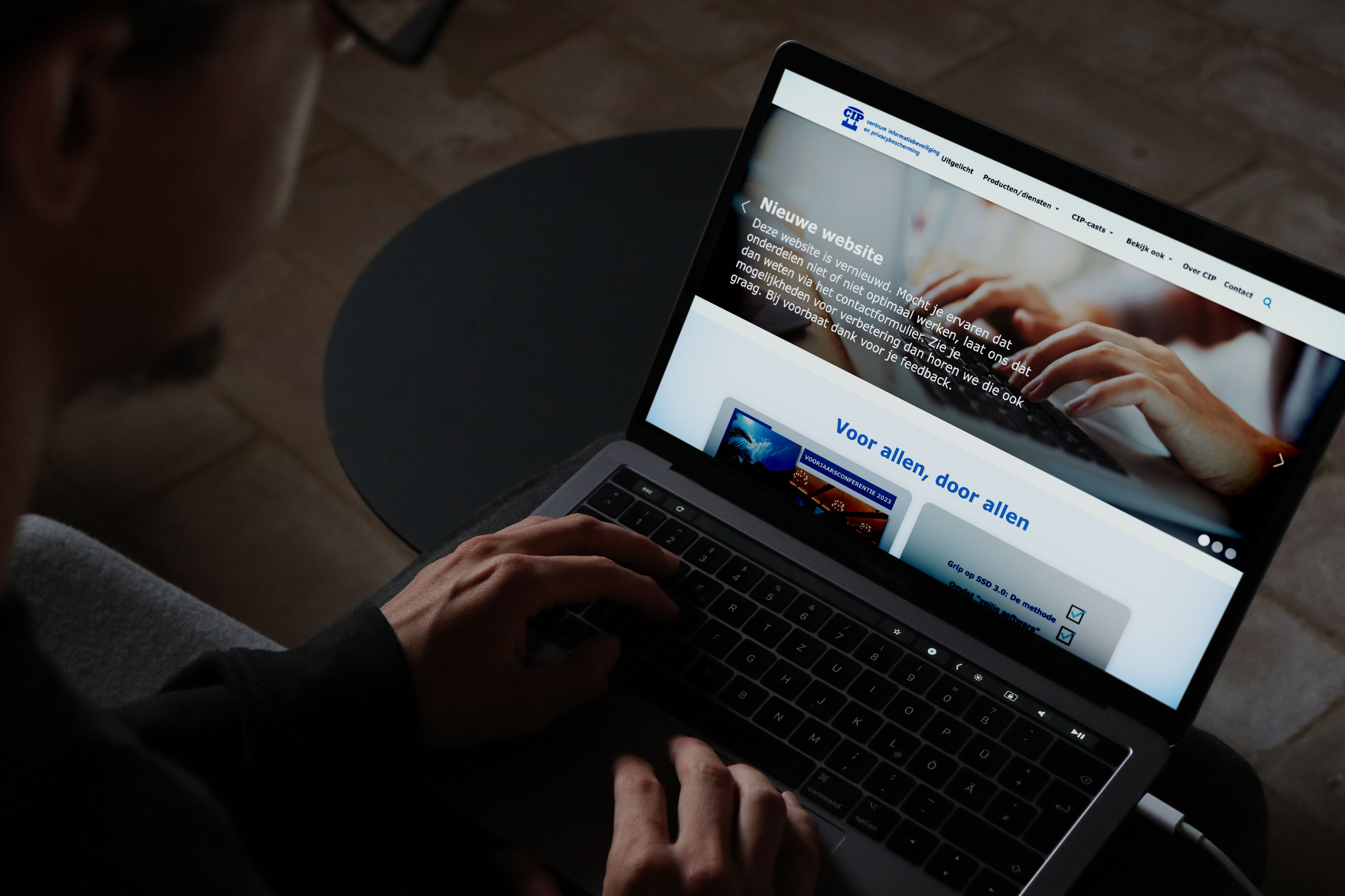
Homepage · desktop
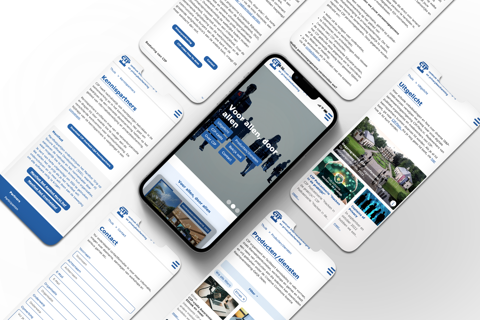
Mobile first · seven templates
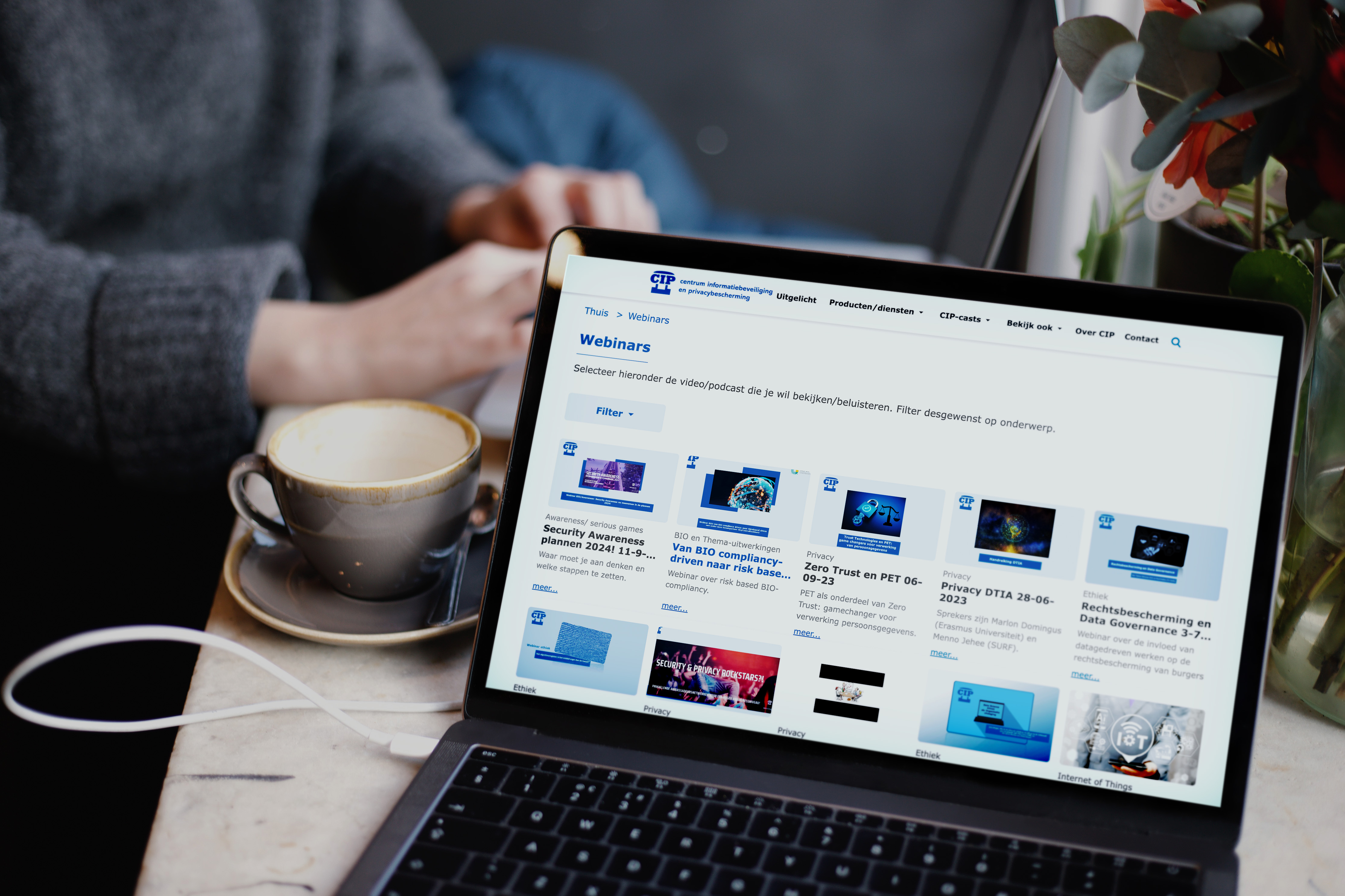
List page · filter by theme

Overview · one card for every type
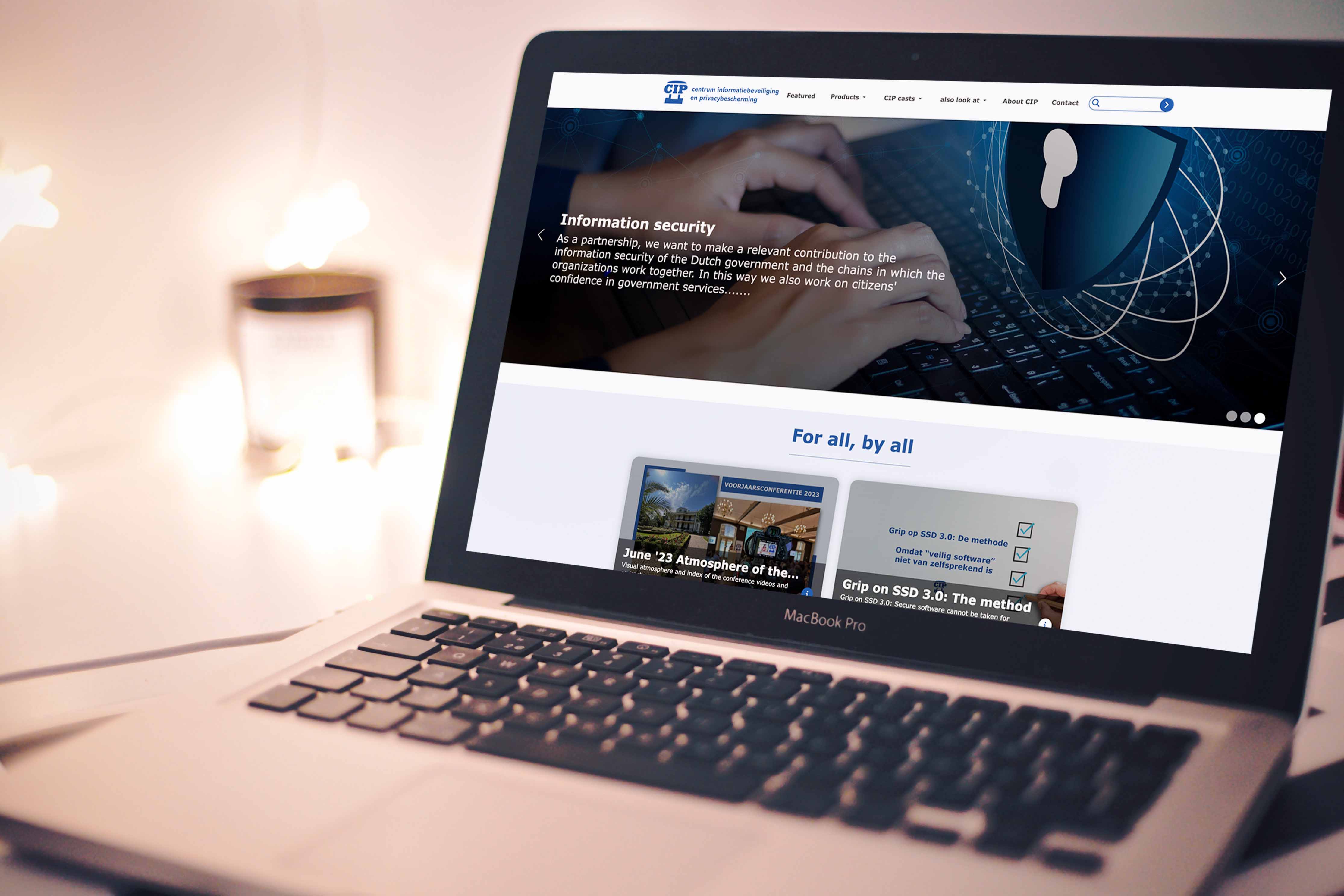
The English version
Secure and privacy-proof, together with the public sector
What are you working on?SearchDPIACloudRisk analysis
Browse by theme
Latest
Types in the main navigation
The must-have to separate product types. Four sections, and each label says what you’ll find there.
Search on every page
The must-have to be easy to search. It stays in the header, so it’s reachable from anywhere.
A hero that asks, not advertises
Search framed as a question, with popular topics as shortcuts. Option B from the UI explorations.
Themes as the second way in
For people who think in topics. The same colour follows each theme onto every card it tags.
Latest, with type labels
Keeps people connected to CIP. Every card says whether it’s an event, news or a product.
Try the pattern: one list, two filters
Showing 27 of 27
10 — Responsive
Designed at 360px first
The structure stays the same at every size. Only the layout changes: 4 columns on a phone, 8 on a tablet, 12 on desktop.
What are you working on?
SearchSearch360px · 4 columns · menu behind one button
What are you working on?
Products
Filters
PrivacyCloud
Show 6 results11 — Test, build, outcome
Tested, refined, reviewed ticket by ticket
We presented the prototype to CIP and tested it with five potential clients. Every note went into one tracked change list, worked through before the build. Then I stayed on: each front-end ticket got a UX review before it went live.
weeks of design, from brief to tested prototype
test sessions: five potential clients, plus CIP
tracked change list, worked through before build
front-end tickets reviewed for UX before launch