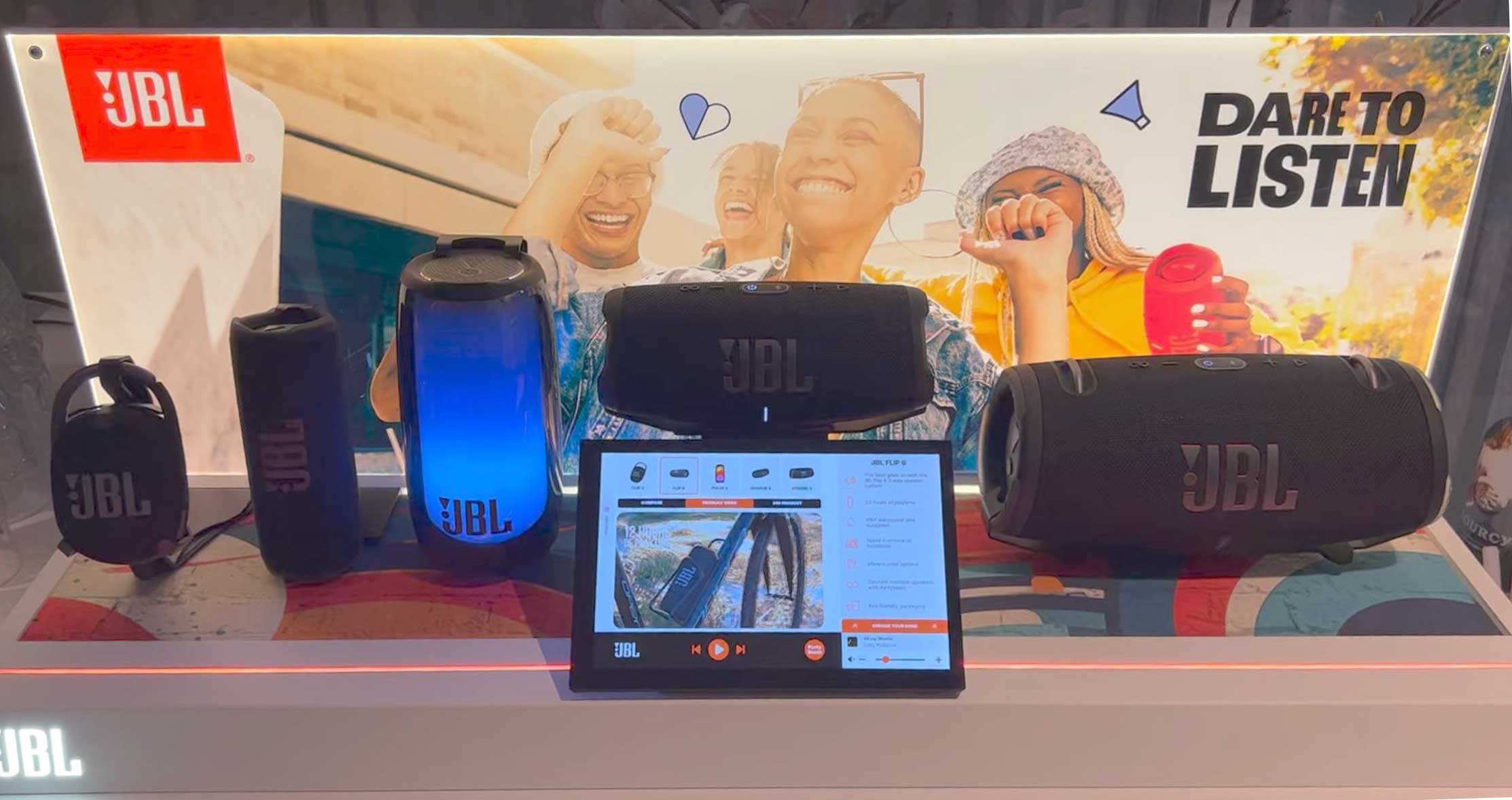
JBL Digital Display: helping shoppers explore, compare and hear speakers in the store
The brief
Seven features, one screen, and a shopper who might only stop for a moment
A shelf of speakers doesn't tell you much. The models look alike, the specs are on small cards, and you can't hear the difference. JBL wanted a display that let shoppers explore, compare and play its speakers right there in the store.
JBL Digital Display: helping shoppers explore, compare and hear speakers in the store
JBL put an interactive in-store display out to tender, with a one-month deadline for the first concept. As the only designer, I designed the full system: a touch display for shoppers, a setup wizard for store staff, and an analytics dashboard for JBL.
Seven features, one screen, and a shopper who might only stop for a moment
On a shelf, the speakers look alike and you can't hear them. JBL wanted shoppers to explore, compare and play them in the store.
One display, three audiences
Who did what
- Competitor analysis and SWOT
- Information architecture and navigation
- Shopper UI: idle screen, product views, compare, music
- Setup wizard
- Dashboard and its event definitions
- Visual system and components
- Figma prototype
- MVP scope, with the PM and developer
- Adapting the design to the existing hardware
- Client and stakeholder reviews
- PM: tender, client relationship and timeline
- Developer: build, hardware integration and data connection
- Hardware: already in place
Starting from a competitor's video, not a blank page
The benchmark was a competitor's display. A SWOT sorted what to match, what to improve and what to do differently.
Most of the friction on a static shelf is in comparing and trying
How a shopper chooses a speaker without a display, with each step matched to a design response.
Four ways it could fail, four rules
The speaker is the anchor. Everything else is a view of it.
There's always one selected speaker. The features are views of it, and music stays in place.
speaker
Two levels deep, so no shopper gets lost
Pick a speaker, then a view. Music, pairing and language work from anywhere.
From "Touch here" to a speaker playing your own music
The product view works as a hub. Every branch returns to it, and switching speakers from the rail is always one tap away.
Tap any step in the flow to see what happens there and why, or walk it from the start.
The screen says something before anyone touches it: a benefit headline and one instruction, “Touch here”. After 60 seconds without a touch, the display comes back to this screen.
Five models in a row, so shoppers start from the speaker they're curious about.
Every branch starts and ends here. The rail on top switches speaker in one tap from any view, and the player at the bottom never moves.
The same rows for every model, with the selected one outlined, so shoppers read across one spec at a time. Close returns to the product view.
Compare, video and 360° are tabs over the same speaker, so switching between them never stops the song.
The speaker from every side, as one more tab of the product view. Close returns to the hub.
The colour variants of the selected speaker. Like every view, closing it brings the shopper back to the product view.
Shoppers pick a song from the list on the right. The player is fixed at the bottom, so the music keeps playing across views and speaker switches.
Shoppers pair their phone over Bluetooth to hear their own music on the speaker in front of them.
The display searches for 20 seconds before it decides, and the product view stays usable meanwhile.
Where the flow is heading: the shopper hears their own music on the speaker they chose.
Try again with a QR code showing the pairing steps, or play from the song list instead. A song that was already playing keeps playing.
Low-fi wireframes: layout before look
Deciding what the first version wouldn't do
With one month and three people, scope was a design decision.
Moving the speakers from the corner to the centre of the navigation
In the first draft, the navigation was organised by feature and the speakers were small thumbnails. I made the speakers the navigation and turned the features into views of each one.
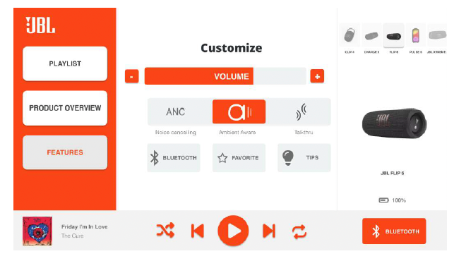
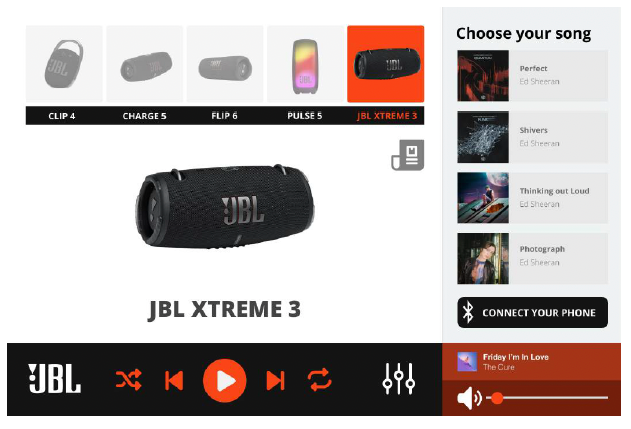
Switching speakers without stopping the song
The product area changes, but the player stays in the same place, so the song keeps playing.
The final experience, annotated
Shipped with every feature in the brief: compare, 360° view, colour variants, music selection, Bluetooth pairing, linking up to four speakers, and a language switch for international shoppers.

- 1Benefit headline.
- 2"Touch here".
- 3Five models in a row. Shoppers start from the speaker they're curious about.

- 1Product rail.
- 2View tabs. Compare, video and 360° are views of the same speaker.
- 3Fixed player.
- 4Language switch. Top right, for international shoppers.

- 1Same rows for every model.
- 2Selected model outlined. Shoppers always know which speaker is theirs.
- 3Feature icons on the side. Key differences can be scanned without reading the table.

- 1Lifestyle image. Shows "waterproof" in use instead of as a line on a spec sheet.
- 2Close button. One tap back to the product view.
Setting up a display in four questions
One question per screen, starting with location, so every display's data goes to the right store.

One platform behind every display
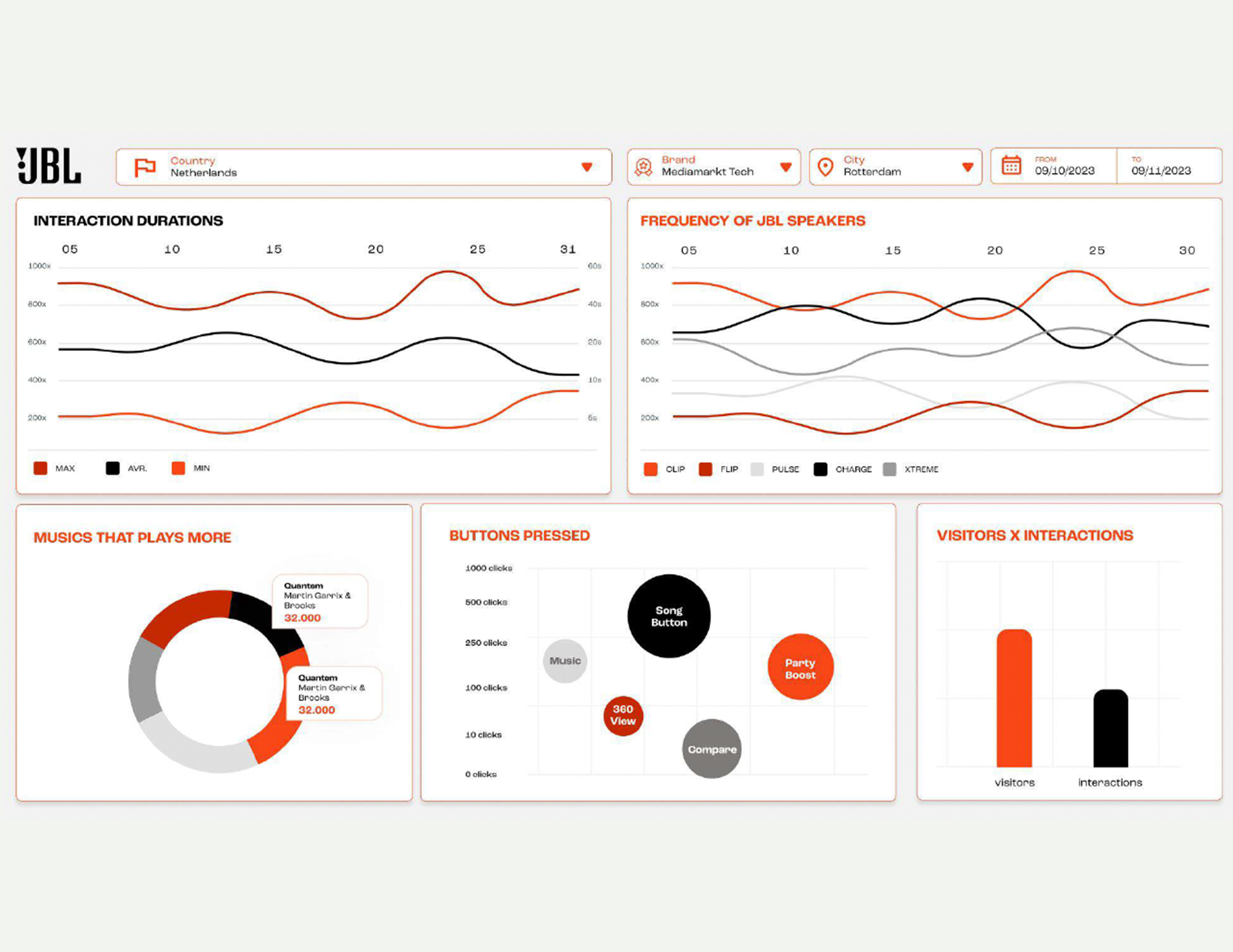
Every display runs on CooCoo Prisma, a SaaS platform for managing in-store screens remotely. From one login, JBL and the Prisma support team change the music, publish and schedule new content, and keep an eye on each display.
I designed the dashboard inside it. Each chart answers one of JBL's questions, store by store:
- Which speakers draw attention?
- Which songs do people play?
- How long do they stay?
- Which buttons get used, and which get ignored?
Try it
Pick a speaker, the way shoppers do it in the store
A working model of the display. Play a song, then switch speakers. When you’re done, switch to Staff and change what’s on the shelf.
CHOOSE YOUR FAVORITE
EVERYWHERE
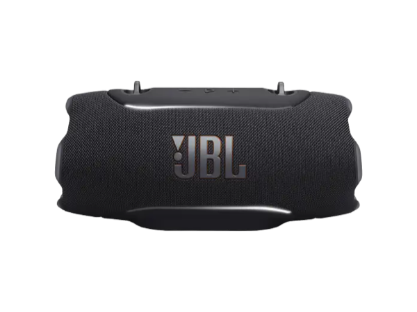 DRAG TO TURN
The screen speaks first
A benefit photo and one instruction, “Touch here”, so nobody has to guess how to start.
The speaker is the anchor
The row of speakers never moves. Tap one and the video, specs, compare and 360° all follow it.
The song keeps playing
Start a song, then switch speakers. The music carries on, so you hear the difference, not a restart.
Compare without walking the shelf
Six answers shoppers asked staff for, side by side, with the speaker you picked outlined.
Staff set the shelf, the display follows
Each box on the shelf gets a speaker from a list, and NEW runs between two dates. The display follows on its own.