Loodswezen
The brief
How might we turn emailed spreadsheets into a service customers can manage themselves?
The initial request was to create a webpage containing digital versions of the existing forms. However, early research showed that simply transferring the Excel fields to a website would preserve many of the original problems.
Loodswezen: from spreadsheets sent by email to a portal that guides every ship request
Loodswezen, the Dutch pilotage service, asked me to put its Excel forms on a webpage. I looked at the service around the forms first and designed a self-service portal instead: customers pick a task, a wizard walks them through it, and employees stop re-typing spreadsheets. It replaced 10 spreadsheets a day.

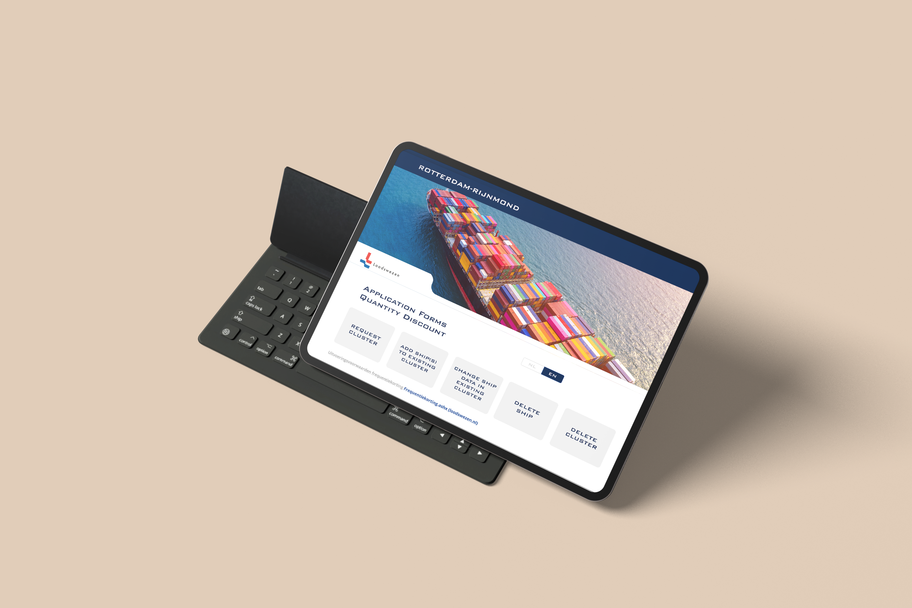
The portal on a tablet: five customer tasks on the first screen.
Challenge
Customers filled in Excel forms sent by email, and had to call or write to change anything. Employees re-typed every sheet.
Team
Me as UX and UI designer, two front-end engineers and the stakeholders at Loodswezen.
My role
Research, interviews, journey mapping, information architecture, user flows, wireframes, prototype, UI and developer hand-off.
Outcome
A portal built around five customer tasks. The first stakeholder review approved the direction; feedback was only on specific fields.
01 — The brief
They asked for the forms on a webpage. The research asked for more
The request was a webpage with digital versions of the existing Excel forms. Early research showed that moving the same fields online would keep the same problems: customers still wouldn’t know which form they needed, and still couldn’t see or change what they had sent.
How might we turn emailed spreadsheets into a service customers can manage themselves?
Requested in the brief
What the research asked for
02 — The old way
Every change meant another email and another spreadsheet
I started with the service around the forms, not the forms. Mapping the first customer journey showed a loop: the request went back and forth by email, and once the sheet was returned the customer lost sight of it.
Step 1
The customer contacts Loodswezen.
Step 2
Loodswezen sends an Excel spreadsheet.
Step 3
The customer fills it in and emails it back.
Step 4
The data sits in Loodswezen’s system. The customer can’t see or change it.
03 — Research
Two groups, one broken loop
I interviewed customers and employees and sent each group its own questionnaire. Their answers went onto empathy maps. Switch between the two groups, and drag the notes around.
Customers found the forms long and unclear, didn’t know what was required, and depended on email or phone for every change. Employees received incomplete sheets, chased customers and re-entered everything by hand. The project had to be more than a digital form: a portal with guided tasks, reusable information, visible progress and one record of every request.
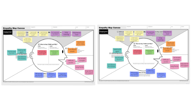
Empathy maps: customers and employees. Click to enlarge.

Customer journey map, with the opportunities under each stage.
04 — Principles
Four problems from the research, and the rule that answers each
Guide complex tasks step by step.
Let customers act without contacting support.
Prevent errors before sending, not after.
One structured source for customers and employees.
05 — Process
Five steps: the whole journey before any screen
I used the Double Diamond to design the complete workflow rather than a set of separate form screens: open up to understand the problem, narrow it to one definition, then open up again to build and test.
The ask
Create new forms for the clients, and a new place for the employees’ data.
Discover
Interviews · customer journey · personas
Define
A customer portal where clients request ship information without calling the company.
Develop
An MVP of the portal.
Deliver
Tests with users and employees.
Along the way I documented the main decisions and turned validated requirements into user stories and scoped tickets for development.
06 — Flow and references
One flow for every task: choose, fill in, check, send
After the research I drew a user flow that every task could share: pick a task, fill in each step, check it, see a summary, then send. Wrong answers loop back to the step, not to the start.
Then I looked at how other products guide people through long forms. Wizards with visible steps kept coming back, so the portal uses one.

User flow: action, decision and display states. Click to enlarge.

Wizard and stepper patterns collected as references.
07 — The key decision
Not a digital copy of the spreadsheet. A portal built around what customers came to do
Drag the handle: on the left, the kind of sheet customers used to receive; on the right, the first screen of the portal.
08 — Try it
Add a ship to a cluster, the way customers do it now
A working model of the portal, in Loodswezen’s own look. Pick Add ship(s), go through the wizard and send the request. Try a wrong IMO number, and switch NL | EN.
Application forms
Quantity discount
Request sent
You can follow it under My requests. No spreadsheet, no email.
My requests
Tasks, not forms
Five entry points in the customer’s words. No need to know which Excel file belongs to which request.
Progress you can see
Short steps, a stepper that fills in, and Back never loses what you typed.
Checks while typing
An IMO number has seven digits. The field says so before you send, not in an email a week later.
Review, then a record
Every answer is shown with an Edit link, and the sent request stays visible under My requests.
09 — Responsive
Desktop, tablet and phone, for work full of data
Customers submit these requests from the office and from the road, so the same tasks and wizard work on every screen size. Drag or use the arrows.
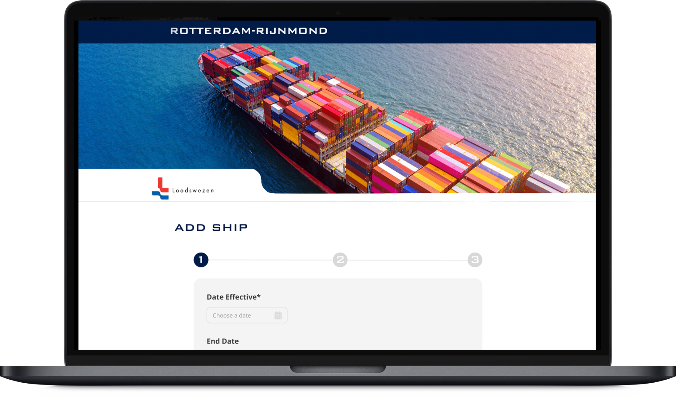
Add ship: step 1 of the wizard.
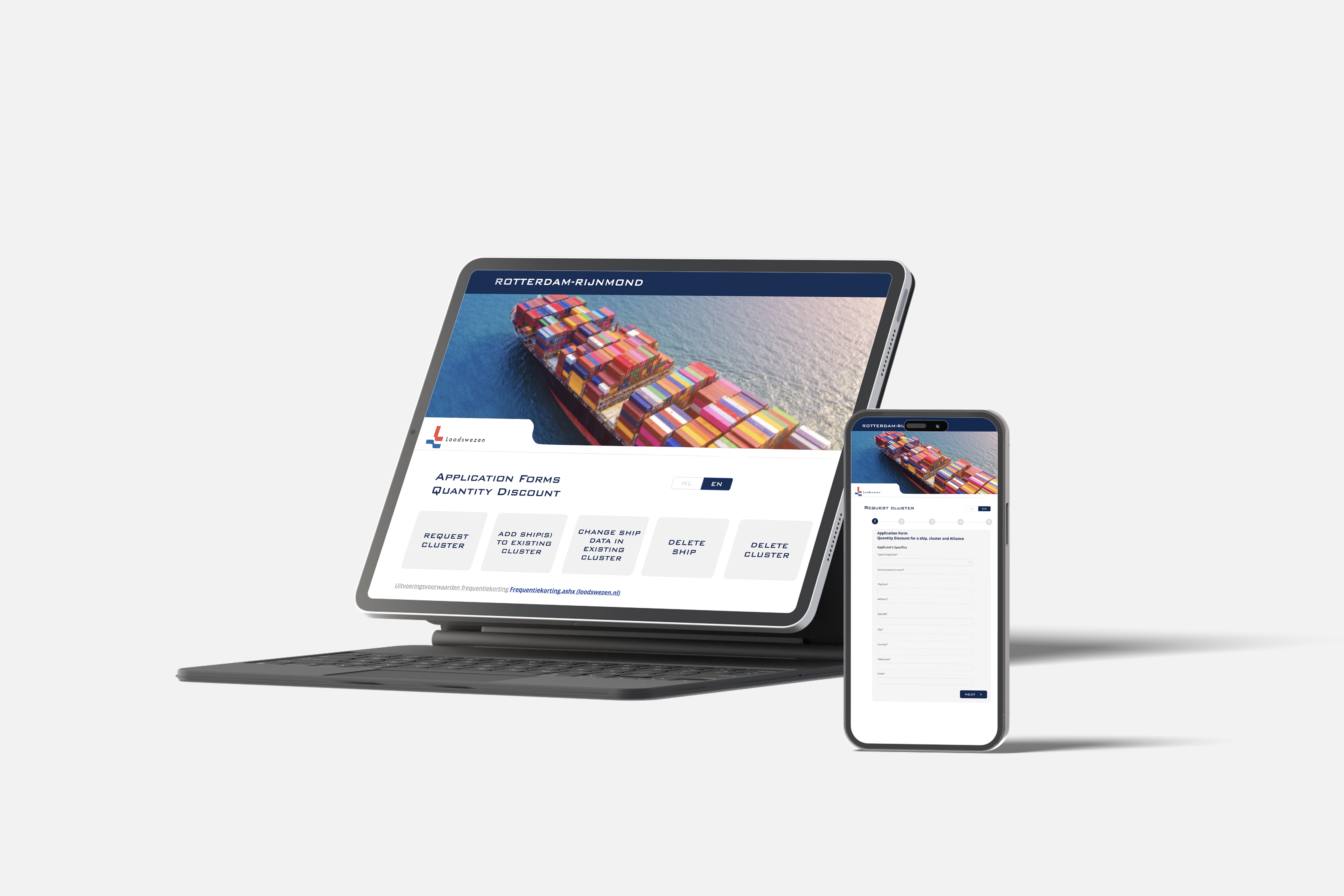
Tasks on a tablet, the form on a phone.
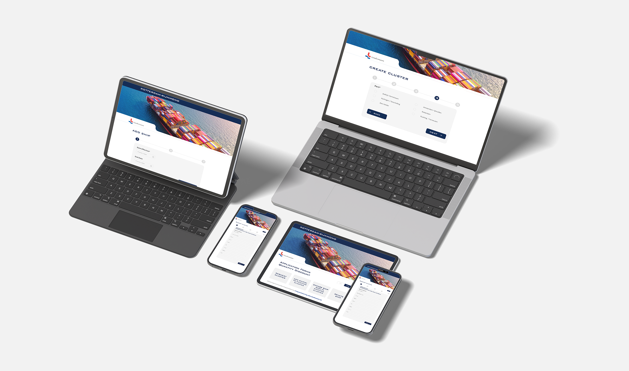
The same flow across devices.

Request cluster on a phone: the stepper stays on top.
The first screen: five tasks.
10 — Defining the MVP
Small enough to build, complete enough to solve the problem
The original scope was forms on a webpage. I proposed an MVP that answered the biggest customer and operational problems without trying to digitise every scenario at once.
Wireflows, page structure plus navigation logic, let us test the whole journey before any high-fidelity design. Lower-priority features were written down for later iterations, so the core could ship and the architecture could still grow.
11 — Hand-off
Tickets that explain behaviour, not only screens
I worked closely with two front-end engineers. Each ticket held a user story, the requirements, the interaction behaviour and acceptance criteria.
Instead of handing over static screens, I explained how states connect: navigation paths, validation, responsive changes and what happens after each action. Regular check-ins solved technical questions early and kept the build close to the approved design.
User story
As a shipping company, I want to add a ship to my existing cluster myself, so I don’t have to email a new spreadsheet.
Acceptance criteria · tick them off
A ticket in the shape I used, rewritten for this page.
12 — Outcome
The first review changed a few fields, not the flow
The prototype made the case the research had started. The feedback was about specific input fields, and those changes went in before development continued.
spreadsheets a day, replaced by one portal
customer tasks on one dashboard, in the customer’s words
short wizard steps instead of one long spreadsheet
front-end engineers I handed off to, ticket by ticket
Want to see it in Figma?